Opening a new canvas and poking at brushes is fun—but it can also leave you with half-finished pieces and messy layers. A simple, repeatable workflow turns Procreate from a toy into a powerful studio.
Why You Need a Repeatable Procreate Workflow
In this class-style guide, we’ll walk from blank canvas to export in clear, repeatable stages. Think of this as your foundational routine that you can tweak for any style.
We’ll cover:
- Canvas setup that won’t bite you later
- Layer structure that keeps things editable
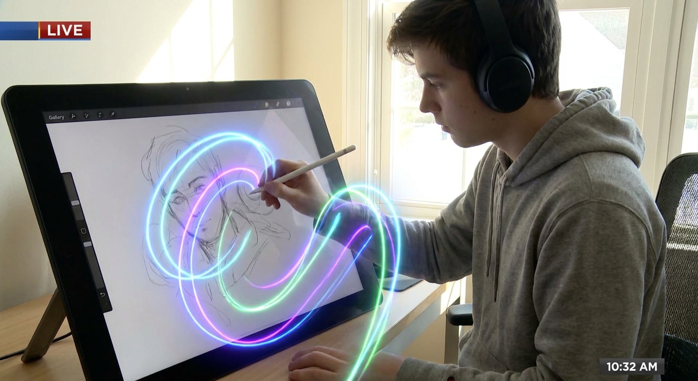
- Pencil sketching tricks
- Clean line art techniques
- Color blocking and shading methods
- Texture passes and final polish
- Export settings that protect quality
Grab your iPad, open Procreate, and let’s build your new default process.
1. Start Smart: Canvas & File Setup
A. Choose the Right Resolution
- Tap + in the Gallery.
- Tap the "+" icon at the top of the canvas list to create a custom size.
For general illustration, try:
- Size: 3000 × 4000 px (portrait) or 4000 × 3000 px (landscape) - DPI: 300 - Color Profile: sRGB IEC61966-2.1 (good all-rounder)
Tip: If you plan to print, match your canvas ratio to your paper (e.g., 4×5, A4) and stay at or above 300 DPI.
B. Name and Organize from the Start
- Tap the canvas name in the Gallery and rename it to something meaningful:
ProjectName_Concept1. - Set up a simple tag system in the Gallery:
WIP,Client,Personal,Study.
Habit to build: Never leave an important canvas titled “Untitled Artwork.” Future-you will thank you.
2. Visual Thinking: Thumbnails Before Details
Instead of zooming in and noodling eyelashes, zoom out and solve the big questions first.
A. Create a Thumbnails Layer Group
- Tap the Layers icon.
- Tap + to create a new layer.
- Tap the layer and choose Group.
- Rename the group:
01_THUMBNAILS.
B. Use a Simple Brush
- Pick Brush Library → Sketching → 6B Pencil.
- Set Opacity ~80%, Size ~10–15%.
C. Draw 3–6 Tiny Compositions
- Use the Selection → Rectangle tool to draw 3–6 boxes on your canvas.
Inside each box, sketch:
- Rough character poses - Big shadow shapes - Major props/background blocks
Aim for 30–60 seconds per thumbnail. These are visual notes, not mini-masterpieces.
Checkpoint: Squint at your thumbnails. Does your focal point read clearly? If not, adjust contrast and shapes now—before details.
3. Rough Sketch: Build on the Best Idea
A. Enlarge the Winning Thumbnail
- Use Selection → Freehand to lasso your favorite thumbnail.
- Tap Transform → Uniform, drag a corner to enlarge it.
- Place it where you want your final piece to be.
B. Create a New Sketch Layer
- Add a new layer above the thumbnails and name it
02_ROUGH_SKETCH. - Lower Opacity of your thumbnail layer to ~20–30%.
- Draw on
02_ROUGH_SKETCHwith the 6B Pencil or HB Pencil.
Focus on:
- Clear gesture and flow lines
- Rough perspective (use Actions → Canvas → Drawing Guide if needed)
- Proportions and big clothing/hair shapes
Tip: Don’t zoom in past 50% yet. Keep it loose and gestural.
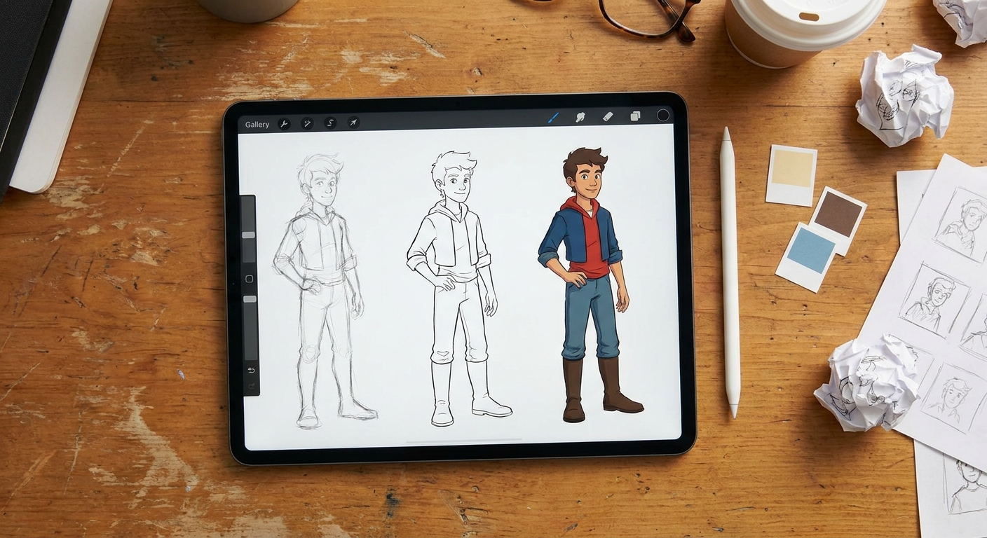
4. Clean Line Art: Smooth but Not Stiff
A. Set Up a Line Art Layer
- Add a new layer on top, name it
03_LINEART. - Reduce the opacity of
02_ROUGH_SKETCHto ~20–30%.
B. Choose a Liner Brush and Settings
Try: Inking → Studio Pen or Ink → Dry Ink.
Adjust:
- Stabilization: In Brush Studio → Stabilization, set StreamLine/ Stabilization around 15–35% to smooth your hand but keep character.
- Pressure: In Dynamics, make sure pressure affects size slightly for varied line weight.
C. Use QuickShape for Crisp Forms
For perfect ellipses, circles, or straight lines:
- Draw the shape in one confident stroke.
- Hold your pencil down at the end of the stroke.
- Procreate snaps it into a clean shape (QuickShape).
- Tap Edit Shape if more precision is needed.
Use this for:
- Halos, glasses, and mechanical parts
- Frames or backgrounds
Exercise: Do one pass focusing only on clean big shapes. Second pass for details like folds and textures.
5. Color Blocking: Paint by Big Shapes First
A. Create Flat Color Layers
- Add a group called
04_COLORS.
Inside, create separate layers:
- Skin - Hair - Clothes - Background
B. Use Selection + ColorDrop
- On the
Skinlayer, select the area using Selection → Freehand. - Pick a base color.
- Drag the color circle into the selected area (ColorDrop).
Repeat for other elements.
Tip: Lock each layer once filled: tap the layer → Alpha Lock. Now you can paint only on existing pixels—no need to re-select.
6. Shading & Lighting: Simple, Repeatable Recipe
A. Decide on a Single Light Direction
Light from top-left is easy and classic.
B. Multiply for Shadows, Add for Highlights
- Above each flat color layer, create a Clipping Mask layer.
- In both cases, use a soft airbrush (Airbrushing → Soft Brush).
Set that layer’s Blend Mode to:
- Multiply for shadows - Add or Screen for highlights
Suggested starting values:
- Shadow color: your base color, made slightly cooler and darker.
- Highlight color: base color shifted slightly warmer and lighter.
C. Keep Shading Organized
Rename layers:
Skin_SHADOWS (Multiply)Skin_LIGHTS (Add)
Repeat for other elements.
Mini-experiment: Duplicate your shadow layer and blur it slightly with Adjustments → Gaussian Blur (slide 3–8%). Toggle it on/off to see if the soft bounce light helps.
7. Texture & Details: The Fun Pass
Textures add life—but they can also destroy clarity if overdone. Keep your focal point in mind.
A. Use Texture Brushes Sparingly
Try:
- Charcoals for rough surfaces
- Organic or Textures for grit and noise
Create a new Clipping Mask above your flat layer and experiment with low Opacity (20–40%).
B. Edge Variety
On a new layer above line art:
- Use a soft eraser to gently fade lines where edges turn away from the light.
- Thicken lines where two shapes meet in shadow.
This adds depth without repainting.
C. Tiny Story Details
Add small, story-driven touches last:
- Freckles, scars, stickers on a laptop
- Dust in sunbeams, leaves, or sparkles
Zoom out regularly. If a detail isn’t visible at 25% zoom, it might not be worth painting.
8. Final Polish: Color Harmony & Adjustments
A. Global Color Adjustment Layer
- Create a new layer at the very top, fill it with a color (like a warm orange or cool blue).
- Set blend mode to
Soft Lightand lower Opacity to 5–20%.
This unifies your colors with a subtle “filter.”
B. Hue/Saturation Tweaks
- Go to Adjustments → Hue, Saturation, Brightness.
- Try adjusting just the Background layer or the Clothes group to push your focal point.
Aim to:
- Keep background slightly less saturated
- Keep focal areas a bit brighter or more saturated
9. Clean Export: Keep Your Options Open
A. Save a Master File
- In the Gallery, swipe left on your artwork → Share.
- Export as Procreate (.procreate) to keep all layers.
Store this in iCloud, Dropbox, or your preferred backup.
B. Export for Web and Print
- Web / Social:
- Export as PNG or JPEG.
- Keep sRGB profile.
- Print:
- Export as TIFF or high‑quality PNG.
- Make sure resolution is 300 DPI.
10. Turn This Into Your Personal Template
The real power move is turning this workflow into a reusable template.
- Open this finished file.
- Delete the artwork inside each layer, keep the structure.
- Save it as
Template_Illustration_Workflow. - Duplicate it for each new piece.
You’ll start every artwork with:
- Thumbnail group
- Rough sketch layer
- Lineart layer
- Organized color and shading groups
Now you’ve got a repeatable Procreate workflow that keeps you fast, flexible, and less overwhelmed.
Next time you open a blank canvas, you won’t be guessing. You’ll be following your own studio routine—one you can keep refining as your style evolves.