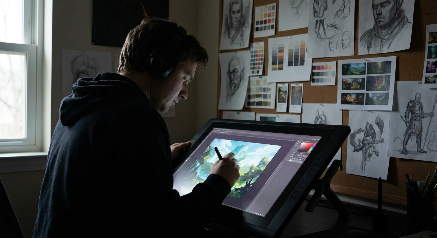
Brushes are not magic, but they do shape how you think. A super-soft airbrush invites you to blend everything. A chunky chalk brush begs for bold shapes. Instead of hoarding brush packs, we’ll build a small, intentional brush set and learn how each brush guides the illustration process.
Why Your Brush Choices Matter More Than You Think
We’ll focus on making and using 4 "core" brush types that work in Photoshop, Clip Studio Paint, Procreate, and Krita.
The Four-Brush Core Set
Think of this as your travel kit: enough for any illustration, without overwhelming choice.
- Hard Round (Workhorse) – structure, flats, crisp edges.
- Soft Round (Atmosphere) – big gradients, gentle blends.
- Textured Brush (Voice) – form, painterly strokes.
- Detail Brush (Precision) – tiny accents.
You can absolutely make a full illustration with only these.
1. Hard Round: The Shape Builder
What It’s For
- Thumbnails and silhouettes
- Clean flats
- Sharp planes (faces, mech, architecture)
Recommended Settings
Photoshop / CSP / Krita:
- Opacity: 80–100%
- Flow: 80–100%
- Pressure: size only
- Hardness: 90–100%
- Stabilization: 5–15%
- Streamline: low, just enough to smooth shaky lines.
Procreate:
Hands-on Exercise: "No Blending" Illustration
Create a small character portrait using only the hard round brush and the Eyedropper tool for color shifting—no soft brush, no smudge. Focus on:
- Placing clear planes of light and shadow.
- Using value steps instead of blur.
You’ll feel how the brush forces you to think in solid shapes.
2. Soft Round: The Atmosphere Maker (Use Sparingly)
What It’s For
- Large, soft shadows
- Ambient light and fog
- Background gradients
Settings
- Opacity: 10–40%
- Flow: 20–60%
- Pressure: affects opacity and size lightly
Good Habits
- Keep it large. If your soft brush is tiny, you’re probably over-blending.
- Use it after you’ve already placed solid values.
Mini Technique: Edge Softening
- Place a hard shadow with the hard round.
- Grab the soft round, low opacity.
- Gently glaze along the edge to soften only where needed.
This combination gives you crisp and atmospheric edges without mud.
3. Textured Brush: Your Style Anchor
This is where your illustrations start to feel uniquely yours.
What Makes a Good Textured Brush
- Visible but not chaotic texture.
- Good at both soft-ish and firm marks.
- Reacts to pen pressure in an interesting way.
Building One (Generic Steps)
In Photoshop / CSP / Krita:
- Start with a basic round brush.
- Add a texture in the brush settings (e.g., "chalk," "paper," "canvas").
- Turn on Angle Jitter: Direction so your brush tip follows your stroke.
- Set Opacity Jitter to Pen Pressure with a moderate curve.
In Procreate:
- Duplicate a default brush close to what you want (e.g., "Narinder Pencil," "Gouache").
- In
Grain, choose a subtle paper or noise texture. - In
Dynamics, adjustOpacityandSizeto respond to pressure.
Brush Testing Drill
Open a new canvas and:
- Paint a value scale from dark to light using only your textured brush.
- Paint a sphere with light from the top-left.
- Paint a quick cube and cylinder.
If you can do all three and they still look clean and readable, you’ve got a solid brush.
4. Detail Brush: Small but Mighty
Purpose
This is not just a tiny brush; it’s a precision tool with predictable behavior.
Settings
- Size: starts very small (1–3 px at 4k canvas), pressure to size.
- Opacity: 100%.
- Stabilization: 15–30% for control.
Use it only in the final 10–15% of your illustration for:
- Eyelashes, highlights on the iris.
- Jewelry edges, stitching, tiny hair clumps.
- Pattern accents, signature.
> Rule: Never start with your detail brush. It will seduce you into noodling instead of building structure.
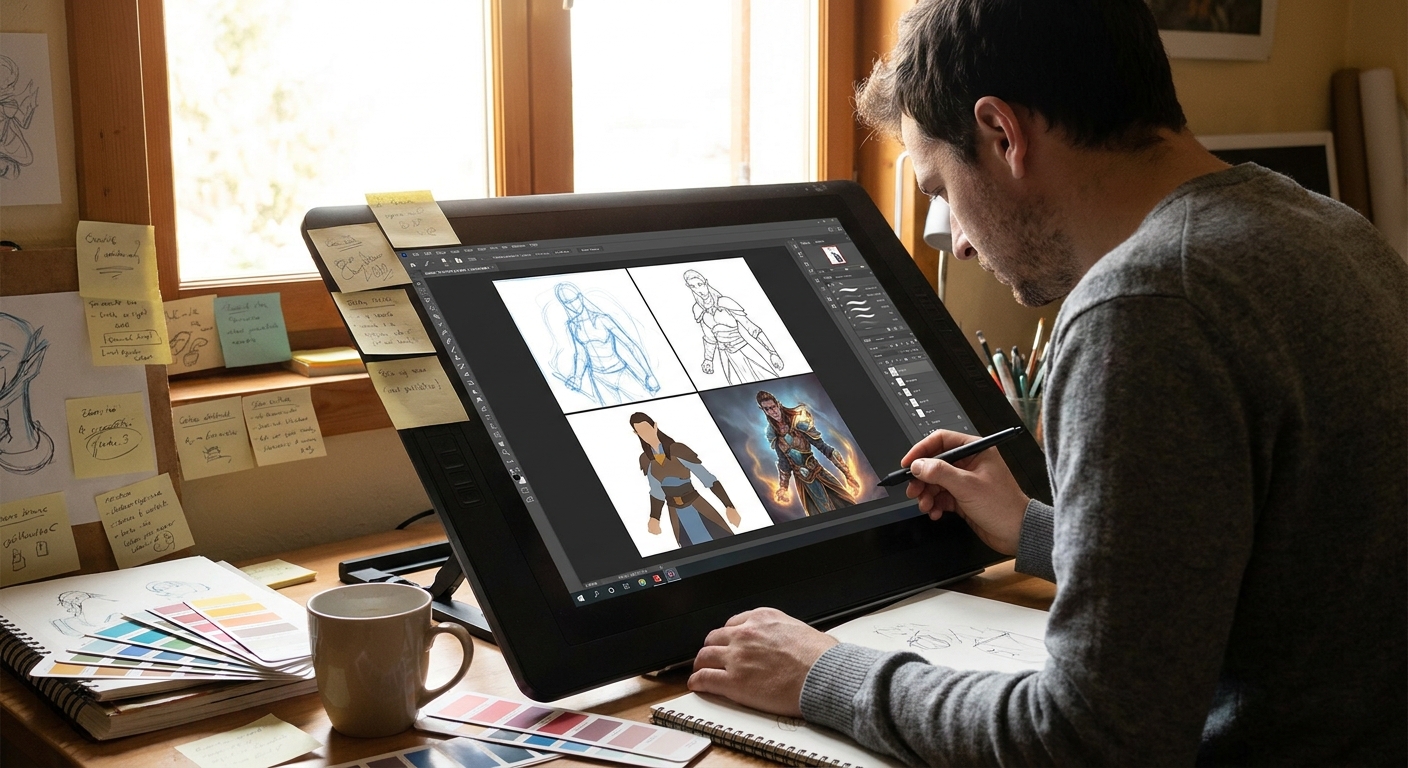
Building an Illustration Around Your Brush Set
Let’s walk a simple workflow with this four-brush kit.
Step 1: Thumbnails with Hard Round
- Canvas: multi-panel, 6–9 small boxes.
- Brush: Hard round.
- Use only 3 values to block in character + environment.
Your brush restriction keeps thumbnails bold.
Step 2: Flats with Hard Round
- Once the composition is chosen, expand it.
- Use the hard round for clean, flat shapes.
- Lock transparency for each major element (skin, hair, clothing, background).
Step 3: Form with Textured Brush
- Switch to your textured brush.
- Start sculpting shadows and midtones.
- Keep the brush bigger than facial features; no tiny rendering yet.
You’ll see how the texture naturally creates visual interest.
Step 4: Atmosphere with Soft Round
- Add background gradients: sky, vignettes, glow.
- Subtle glazes of color for mood (blue in shadows, warm in lights).
Step 5: Final Polish with Detail Brush
- Zoom to 50–70%, not 300%.
- Hit only focal points with small accents: eyes, lips, edges of key props.
Because most of the painting was done with broader brushes, these small marks stand out.
Visual Thinking: Let the Brush Decide the Stage
Here’s a useful mental model: assign each brush to a stage of thinking.
- Hard Round = Design Brain
You’re solving composition, shapes, value structure. No fancy edges.
- Textured Brush = Sculpting Brain
You’re turning shapes into volumes, adding character and nuance.
- Soft Round = Atmosphere Brain
You’re suggesting air, distance, mood.
- Detail Brush = Editor Brain
You’re deciding what matters enough to sharpen.
If you catch yourself using a detail brush while you’re still in “design brain,” you’re probably skipping steps.
Experiment Assignments to Discover Your Style
Experiment 1: One Brush, Three Illustrations
- Pick only your textured brush.
- Create three different small illustrations: portrait, object, environment.
- Notice which looks the best. That’s a clue to what you enjoy painting and how your brush wants to move.
Experiment 2: Hard Round vs Textured Split
- Create a character illustration.
- Left half: painted only with hard round.
- Right half: painted only with textured brush.
Compare the mood and readability. Decide where each side works better—maybe the face wants cleaner shapes, the clothing enjoys texture.
Experiment 3: Restrict and Release
- First 70% of painting: only hard round + one textured brush.
- Last 30%: unlock soft round and detail brush.
You’ll feel how much structure you can build before "fancy" tools even enter.
Managing Brush Bloat
If your brush panel is chaos, try this:
- Create a folder/set called
CORE 4. - Place your chosen four brushes inside.
- For one full illustration, use only those.
- Only add a brush if your current set genuinely cannot do a specific job (e.g., foliage scatter, halftone).
Soon, you’ll have a small, trusted toolkit and your illustration style will be more consistent and intentional.
Conclusion: Your Brushes, Your Behavior
The brushes you pick don’t just change the look of your illustration—they change how you think while creating it. By designing a compact, purposeful brush set and tying each brush to a specific stage of your workflow, you turn your tools into creative constraints that actually unlock more freedom.
Keep experimenting, tweak settings, and every few months, repaint an old piece with your refined brush kit. The evolution of your illustrations will tell you clearly: your brush alchemy is working.