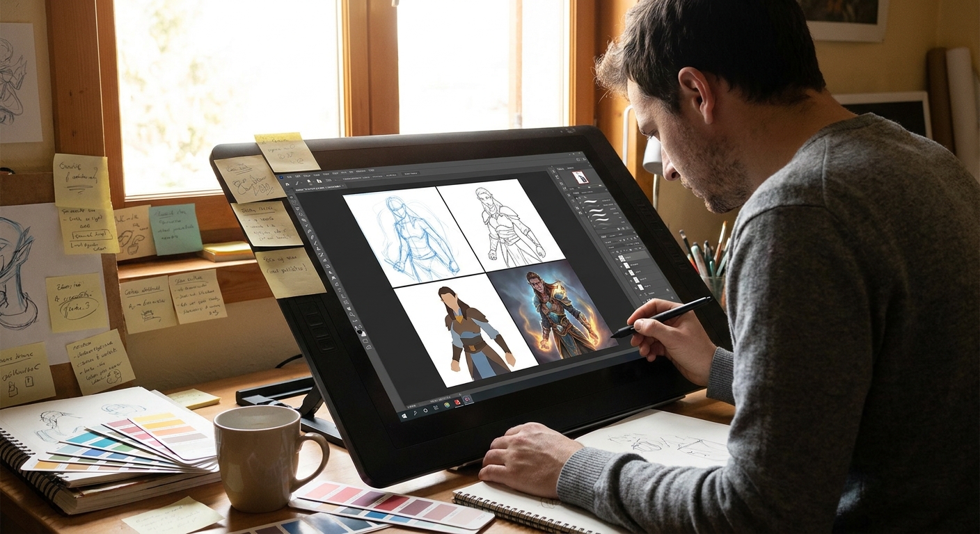
Every artist has a folder full of half-finished doodles. Let’s rescue one.
Overview: Turning a Casual Sketch into a Finished Illustration
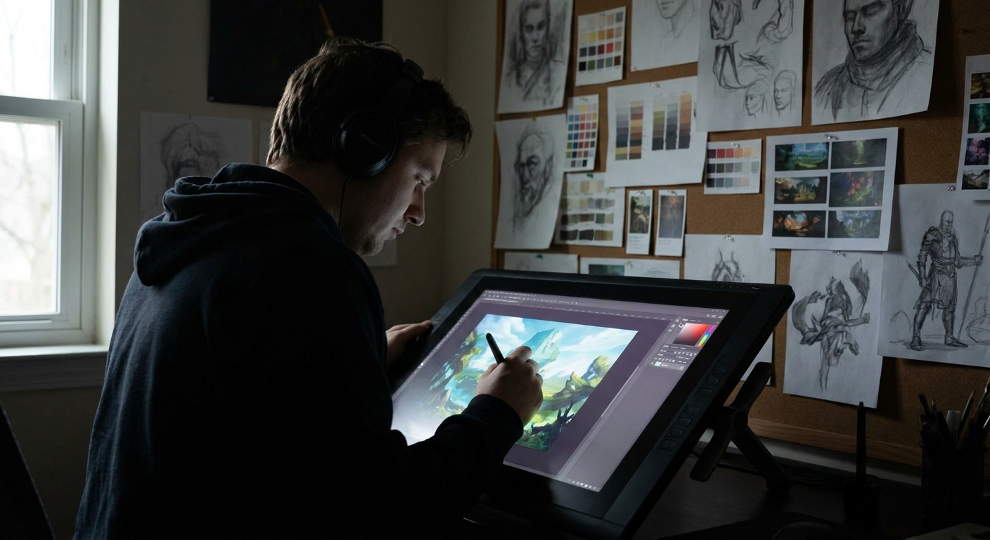
In this walkthrough, we’ll take a loose character doodle and push it all the way to a polished illustration. Think of this as a guided studio session: I’ll give you concrete steps, brush settings, and checkpoints where you can stop, evaluate, and push further.
You can follow along in Photoshop, Clip Studio Paint, Procreate, or Krita.
Step 1: Choosing and Cleaning the Doodle
1.1 Pick the Right Sketch
Look for a doodle that has at least one of these:
- Strong pose or attitude (even if messy)
- Interesting silhouette
- Clear facial expression
Avoid sketches that are stiff or confusing; we’re building momentum, not fighting a corpse.
1.2 Import and Clean
- Scan or photograph your sketch, or import directly if it’s digital.
- Create a new canvas: 3000–4000px on the long side, 300 dpi.
- Drop the sketch in, center it.
Adjust the sketch layer:
- Set layer mode to Multiply. - Use Levels/Curves to make lines dark and the background light. - Lower opacity to 20–40% so it doesn’t overpower your drawing.
> Tip: In Procreate, use Adjustments → Curves to bump contrast, then reduce layer opacity.
Step 2: Solid Under-Drawing (The “Real” Sketch)
Think of your original doodle as the idea, not the blueprint. Now we build a clean, confident under-drawing.
Brush Setup
- Brush: Pencil-style brush with slight texture.
- Size: 6–10 px at 4k resolution.
- Opacity: 100% with pen pressure on size only.
- Stabilization: 10–20% (CSP/Photoshop) or Streamline ~15–30% (Procreate).
Process
- Make a new layer above the lightened sketch (
UNDERDRAWING).
Redraw the pose using simple forms first:
- Head: ball + jaw wedge - Torso: box or cylinder - Limbs: cylinders or tapered tubes
Check proportions:
- Big shapes first, details last. - Flip canvas horizontally every few minutes. 4. Add costume shapes and major props, still using simple geometry.
This layer is where you solve anatomy, gesture, clothing logic, and perspective.
> Hands-on exercise: Force yourself to use only straight lines and simple curves for 10 minutes. This removes the temptation to scribble.
Step 3: Clean Line Art (Optional but Powerful)
If your style leans painterly, you can lightly skip this. If you enjoy clarity or might animate later, this is your skeleton.
Brush Settings
- Brush: Inking brush, crisp but not too stiff.
- Size: 3–6 px, pressure-sensitive.
- Opacity: 100%.
- Stabilization: Slightly higher than your sketch (20–35%).
Technique
- Lower
UNDERDRAWINGopacity to 20–35%. - Create a
LINEARTlayer above. - Use single, deliberate strokes as often as possible. Rotate the canvas for comfortable stroke directions.
Vary line weight:
- Thicker lines on outer contour and shadow-side edges. - Thinner lines on inner details and light-side edges.
Keep detail controlled:
- More line detail in the focal area (e.g., face, hands). - Less detail in secondary areas.
When you’re happy, group and lock or collapse your sketch layers. Mentally commit.
Step 4: Flat Colors (The Underpainting of Digital Work)
Flats are the foundation: clean, solid shapes you’ll shade on top of.
Layer Setup
BG– background flat colorCHAR_BASE– character base color- Extra layers for props, hair, clothes if needed
Technique: Lasso + Fill
- Fill
BGwith a midtone color (not pure white; aim for soft gray-blue or warm beige). - On
CHAR_BASE, use the Lasso Tool or a hard-edged brush to outline the character’s silhouette. - Hit Fill (Alt+Backspace or equivalent) to fill with a base skin or clothing color.
- Lock Transparency (Alpha Lock in Procreate) on each flat layer.
> Brush for flats: Hard round, opacity/flow 100%, pressure only affects size.
Keep colors a bit desaturated; you can intensify later.
Step 5: Establishing Light and Shadow
Forget fancy textures. We’re just thinking: “Where is the light?”
5.1 Choose Your Light Source
Decide:
- Direction: above, side, below, backlit?
- Hard or soft: sunlight vs cloudy window vs lamp?
- Color temperature: warm or cool?
Write it down on a small text layer: WARM LIGHT FROM TOP LEFT.
5.2 Shadow Layer Method
- Create a new layer above your flats called
SHADOWS. - Set it to
Multiply. - Pick a neutral shadow color: a desaturated purple, blue, or warm gray.
Use a soft-ish round or textured brush:
- Opacity: 30–60% - Flow: 40–70%
Paint shadows broadly:
- Under chin, nose, eye sockets
- Under hair masses
- Under clothing folds and overlap
- Cast shadows from props
Once shadows are mapped, erase with a soft brush to refine transitions.
Step 6: Adding Light and Form
Now we model the character so they feel 3D.
6.1 Light Layer
- Create a
LIGHTlayer aboveSHADOWS. - Set to
OverlayorSoft Light. - Choose a light color (usually warmer than local color: soft yellow/orange for warm light).
- Use a soft brush for big planes; switch to a hard brush for smaller highlights.
Paint where light hits directly:
- Top planes of cheeks, nose bridge
- Forehead plane facing the light
- Tops of shoulders, upper arms
- Top edges of hair clumps
6.2 Direct Highlights
- Create a
HIGHLIGHTSlayer on top, normal blend mode. - Use a small, hard brush.
- Choose a light, saturated color (near white but not pure).
Add sparingly:
- Eye sparkle - Lip highlight - Tip of nose - Jewelry, glasses, metallic trim
> Rule: If everything is shiny, nothing is shiny. Reserve hard highlights for your focal points.
Step 7: Background that Supports the Character
Don’t overcomplicate. The background should frame, not fight.
Quick Background Strategies
Simple gradient + shape:
- Gradient from darker near edges to lighter behind the face. - Add 1–2 large shapes (window frame, wall, trees) to suggest environment.
Abstract but directional:
- Use big brush strokes that subtly point toward the character.
Shape echo:
- Repeat shapes or colors from the character in the background (circles, diagonals) to unify.
Use softer edges and lower contrast in the background than on the character.
Step 8: Edges, Color Tuning, and Final Polish
This phase turns "good" into "finished".
8.1 Edge Control
Zoom out to ~50–70%. With a small hard brush and an eraser:
- Sharpen edges around face, hands, props held by hands.
- Soften edges in hair tips, clothing away from the focal area.
In Photoshop/CSP, use the Smudge Tool with a textured brush at 20–40% strength for painterly transitions.
8.2 Color Adjustment
Add one or two adjustment layers:
Color Balance: warm up lights, cool down shadows slightly.Hue/Saturation: gently nudge saturation (+5 to +10).Gradient Map: set low opacity (5–15%) to unify color mood.
8.3 Texture Pass (Optional)
On a top layer set to Overlay or Soft Light:
- Use a subtle paper or noise texture.
- Keep opacity around 10–20%.
This adds tooth and breaks up digital smoothness.
Step 9: Self‑Critique Checklist
Before calling it done, run through this list:
Readability: Can you tell what’s going on from a small thumbnail?
Focal Point: Does the eye go to the face/hands first?
Lighting: Is the light direction consistent?
Values: Does the character separate clearly from the background?
Edges: Are there sharp edges where needed and soft edges elsewhere?
Color Harmony: Do colors feel like they live in the same world?
Note 2–3 improvements, apply them, then stop. Overworking kills freshness.
Turning This into a Repeatable Habit
Repeat this process with different doodles:
- Week 1–2: Focus on clean under-drawing and flats.
- Week 3–4: Focus on lighting and edge control.
- Week 5+: Start pushing backgrounds and storytelling props.
Each time, keep the steps, but play with variables: new lighting, new palettes, different brush textures. Treat the process as a lab where every illustration is an experiment. The more reps you get, the sooner your "random doodle" turns into a fully intentional illustration machine.