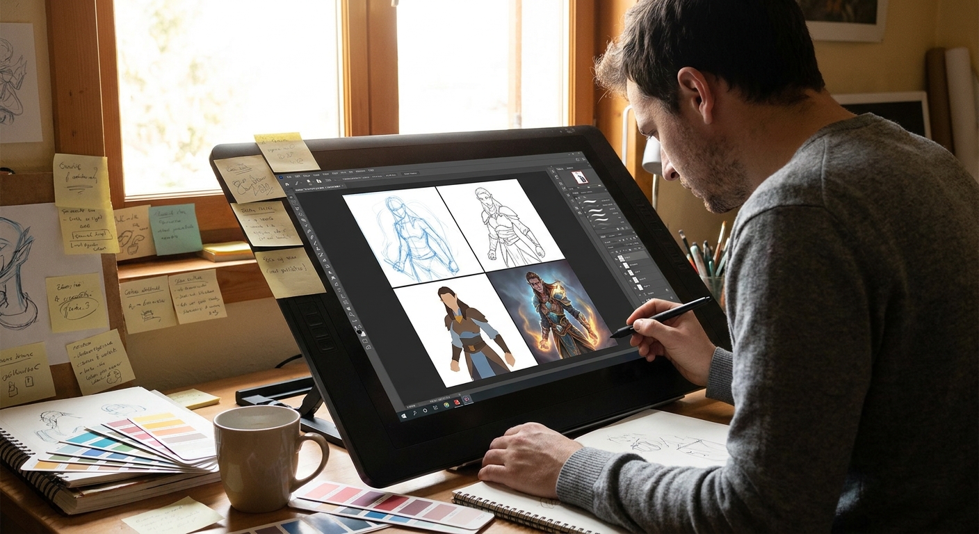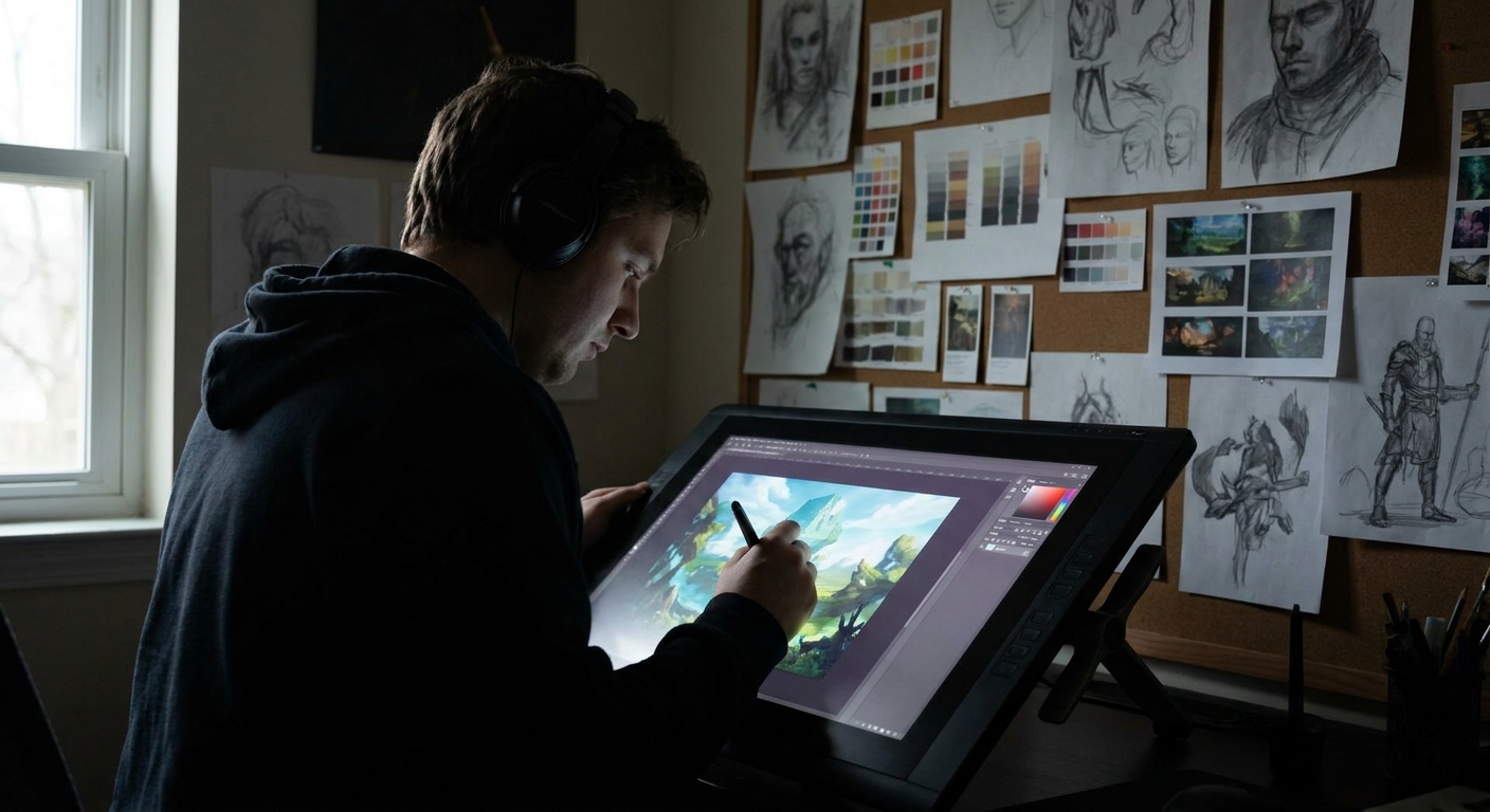
Most digital artists learn brush tricks long before they learn visual planning. But the strongest illustrations aren’t just beautifully rendered—they’re designed. This article treats illustration like a hands-on design problem: we’ll build your piece step-by-step using a clear framework you can reuse on any project.
Introduction: Illustration as Design in Disguise
We’ll use Photoshop/Clip Studio/Procreate terms, but the ideas work in any software.
The Intent Grid: What Is This Illustration For?
Before sketching, answer three questions. Grab a sticky note, your Notes app, or a new text layer.
Message – What should a viewer feel or understand in 3 seconds?
- Example: “Adventurous but cozy fantasy tavern.”
Focus – What is the single most important thing?
- Example: “The character’s laughing face at the bar.”
Audience & Use – Who is this for and where will it live?
- Example: “Social media banner, mostly viewed on phones.”
Write:
> MESSAGE: adventurous / cozy
> FOCUS: laughing face
> USE: social banner / small screens
Keep this visible in your canvas.
Step 1: Thumbnails with Purpose (15–20 Minutes)
Think of thumbnails as visual experiments, not mini-masterpieces.
Canvas & Tools
- Canvas size: ~2000–3000px wide (so thumbnails don’t get too tiny for your hand)
- Brush: Hard round, 80–100% opacity, size jitter off
- Color: Start in grayscale
Process
- Fill your canvas with a mid-gray background.
- Draw 6–9 boxes (tiny frames) with a darker gray.
- Inside each box, block in rough shapes (no details) in 2–3 values: background, midground, foreground.
Try a different camera angle in each:
- Eye-level, close-up on the face - Over-the-shoulder angle from bar-level - Wide shot with face framed by tavern lights 5. Squint or zoom out to 10–15%. Ask: Which one reads the message and focus fastest?
Circle the top 2 thumbnails, duplicate them, and push each one further. Don’t fall in love yet.
> Hands-on challenge: Limit yourself to 3 values only (dark, mid, light). No gradients. This forces clear read.
Step 2: Value Map & Big Shapes
Pick your winning thumbnail and enlarge it.
Setup
- Canvas: 4000–5000px on the long edge (plenty of resolution)
- Layers:
BG– background tonesMID– characters/propsFG– foreground framing- Brush: Hard round + a soft round (only for big gradients)
Block-in Technique
- On
BG, paint the main value of the tavern walls and atmosphere. - On
MID, block in the character as a single silhouette (no facial details yet). - On
FG, add any framing shapes (bar counter, hanging signs, foreground bottles).
Establish a value hierarchy:
- Background: medium-light - Character: darker midtone - Focal face area: lighter or contrasted
Toggle the canvas to pure black & white (Image → Adjustments → Threshold or a Black & White adjustment layer) to test your contrast. Your focal area should pop.
Step 3: Visual Path – Leading the Eye on Purpose
Think about how the viewer’s eye travels.
Three Simple Visual Path Tools
- Converging lines: Beams, bar edges, stools subtly pointing toward the face.
- Value contrast: Strongest dark/light contrast around the focal point.
- Color temperature (later): Warm around the focus, cooler elsewhere.
On a new layer in bright red, lightly draw arrows showing your current visual path. Adjust shapes to guide the eye more deliberately.
> Tip: In Clip Studio & Photoshop, use a red pencil brush on a temporary “Notes” layer. In Procreate, use a new layer at 50% opacity so it’s easy to ignore later.
Step 4: Clean Line or Shape-Based Painting?
Decide your rendering approach:
Option A: Line-First
Best for clear characters, comics, and graphic styles.
- Create a
LINEARTlayer on top, set to Multiply. - Brush:
- Size: 3–7 px at 4–5k resolution
- Opacity: 100%
- Stabilization: 10–25 (CSP) / Streamline: 20–40% (Procreate)
- Trace only essential edges: face features, key costume elements, important props.
Option B: Shape-First (Painterly)
Best for painterly or concept-art looks.
- No hard lines; refine the existing value shapes.
- Use a hard round brush and a square or chalky brush for edges.
- Work with Lock Transparency on each major shape layer so you can paint neatly inside.
Pick one method and stick with it for this piece.
Step 5: Color Strategy – Limited First, Then Expand
Avoid opening the entire rainbow.
Simple Color Framework
- Choose one main temperature: warm or cool.
- Tavern = warm (oranges, reds, yellow lights)
Pick a limited palette:
- Warm: dark red, muted orange, warm beige, desaturated blue for accents. 3. Use a Gradient Map or Color layer above your grayscale to test color schemes quickly.
Practical Setup
- In Photoshop:
- Add a
Gradient Mapadjustment, experiment with 2–4 color stops. - Or add a layer set to
ColororOverlay, paint broad color zones. - In Procreate:
- Use
Hue/Saturationper layer, or add a top layer set toColorand glaze. - In CSP:
- Use
Gradient Mapor set a color layer toOverlay/Colormode.
Try at least three color variations in quick succession. Save each as a group.
Step 6: Brush Settings for Confident Rendering
Core Brush Trio
Hard Round – Clean planes
- Opacity: 80–100% - Flow: 70–100% - Pressure affects size only
Textured/Chalk Brush – Edges & texture
- Opacity: 60–90% - Flow: 40–70% - Slight size + opacity pressure
Soft Round / Airbrush – Only for large gradients
- Opacity: 10–30% - Flow: 20–40%
> Rule of thumb: 80% of your painting with hard or textured brushes, 20% with soft. This keeps things solid.
Rendering Method
- Start with a slightly bigger brush than feels comfortable; this keeps you out of detail hell.
- Render big planes of the face first (forehead, cheeks, jaw), then smaller features.
Use edge variation:
- Hard edges at focus (eyes, mouth). - Softer edges farther away (background bottles, distant patrons).
Step 7: Visual Checks and Iterations
Set timers for 10–15 minute sprints where you stop and evaluate.
Use these checks:
- Flip Canvas (horizontal): instantly reveals awkward shapes.
- Zoom to 10–15%: Does the focus still read? If not, fix values.
- Grayscale Check: Add a Black & White adjustment layer on top.
- Tiny Edit Layer: Create a small
NOTESlayer in neon color and scribble quick fixes: “Darken behind face,” “Simplify bottles,” etc.
Iterate 2–3 times. Don’t be precious.
Step 8: Final Polish – Details that Actually Matter
Details should support your intent grid, not random areas.
- Zoom in only to 50–70% (avoid 300% micro-rendering).
Add detail to:
- Eyes, eyebrows, mouth shape - Hands touching objects - Key props near the face (mug, lamp, bar sign)
Reduce detail in:
- Far walls, background patrons - Floor, ceiling, unimportant clutter
Use layer modes for subtle pop:
Soft Lightlayer for light bounce and gentle glow around the focal area.Overlayfor boosting selective contrast, very sparingly.Color Dodgeonly with low-opacity brushes and mid-value colors for highlights.
A Reusable Illustration Checklist
For your next project, run through this compact checklist:
- Intent Grid: Message, Focus, Use written clearly.
- Thumbnails: 6–9 small comps, 3-value limit.
- Value Map: Background/midground/foreground layers, strong read.
- Visual Path: Arrows, converging lines, contrast around focus.
- Workflow Choice: Line-first or shape-first—commit.
- Limited Palette: One temperature, 3–5 base colors.
- Brush Trio: Hard, textured, soft (in that order of priority).
- Iteration Sprints: Flip, zoom-out, grayscale checks.
- Focused Detail: Sharpen only what serves the message.
Treat every illustration as a design problem plus painting playground. The more you practice this framework, the more “lucky accidents” you’ll be able to control—and the more intentional, powerful your art will feel.