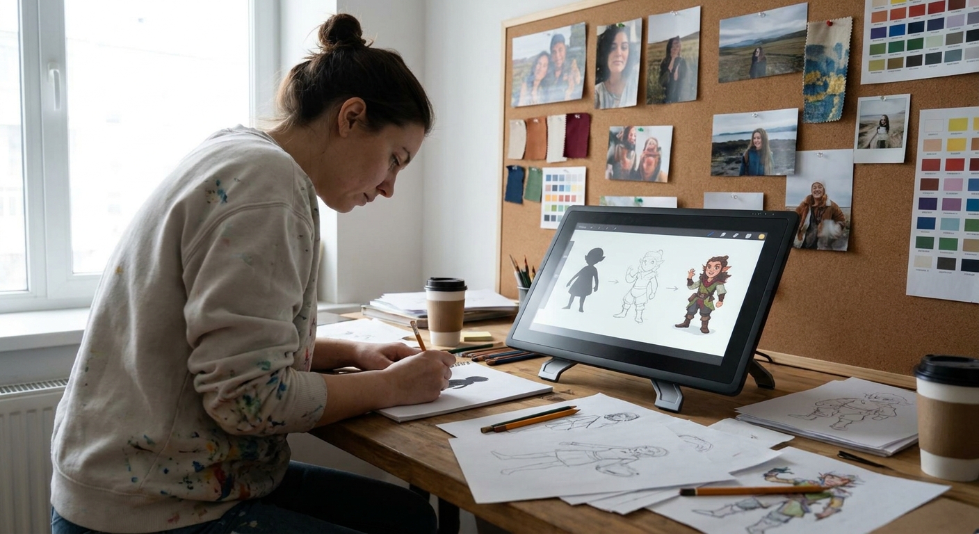
The same character drawn with a crunchy ink brush versus a soft airbrush feels completely different. Your brush settings aren’t just technical—they’re emotional levers.
How Brush Choices Shape Your Characters
This article is a hands-on tour of using brushes to shape personality, material, and mood in your character designs. We’ll cover:
- Core brush types for character work
- Recommended settings in popular apps
- Step-by-step mini-projects
- How to build your own “character brush kit”
You don’t need fancy premium brushes; you need a few good tools, used intentionally.
Core Brush Types for Character Design
Think of brushes like instruments in a band. Each one has a role.
1. The Gesture Pencil
Use this for:
- Thumbnails
- Gesture poses
- Rough facial expressions
- Shape: soft, slightly textured round
- Size: 3–8 px on a 2500–3000 px canvas
- Opacity: 40–80%, pen pressure on
- Flow: 70–100%
Recommended settings:
The goal is a brush that encourages movement and doesn’t punish mistakes.
2. The Inker (Line Art)
Use this to define form and style.
Settings:
- Shape: hard round or tapered inker
- Size: 3–6 px for main lines, 1–3 px for details
- Opacity: 100% (no pressure opacity)
- Size: controlled by pen pressure
- Stabilization: 10–25%
This brush should give you clean, confident lines with variable weight.
3. The Flat Filler
Use this for flat colors and big shapes.
Settings:
- Shape: solid round or flat
- Opacity: 100%
- Flow: 100%
- No texture, no scattering
You want edges that are crisp and easy to select later.
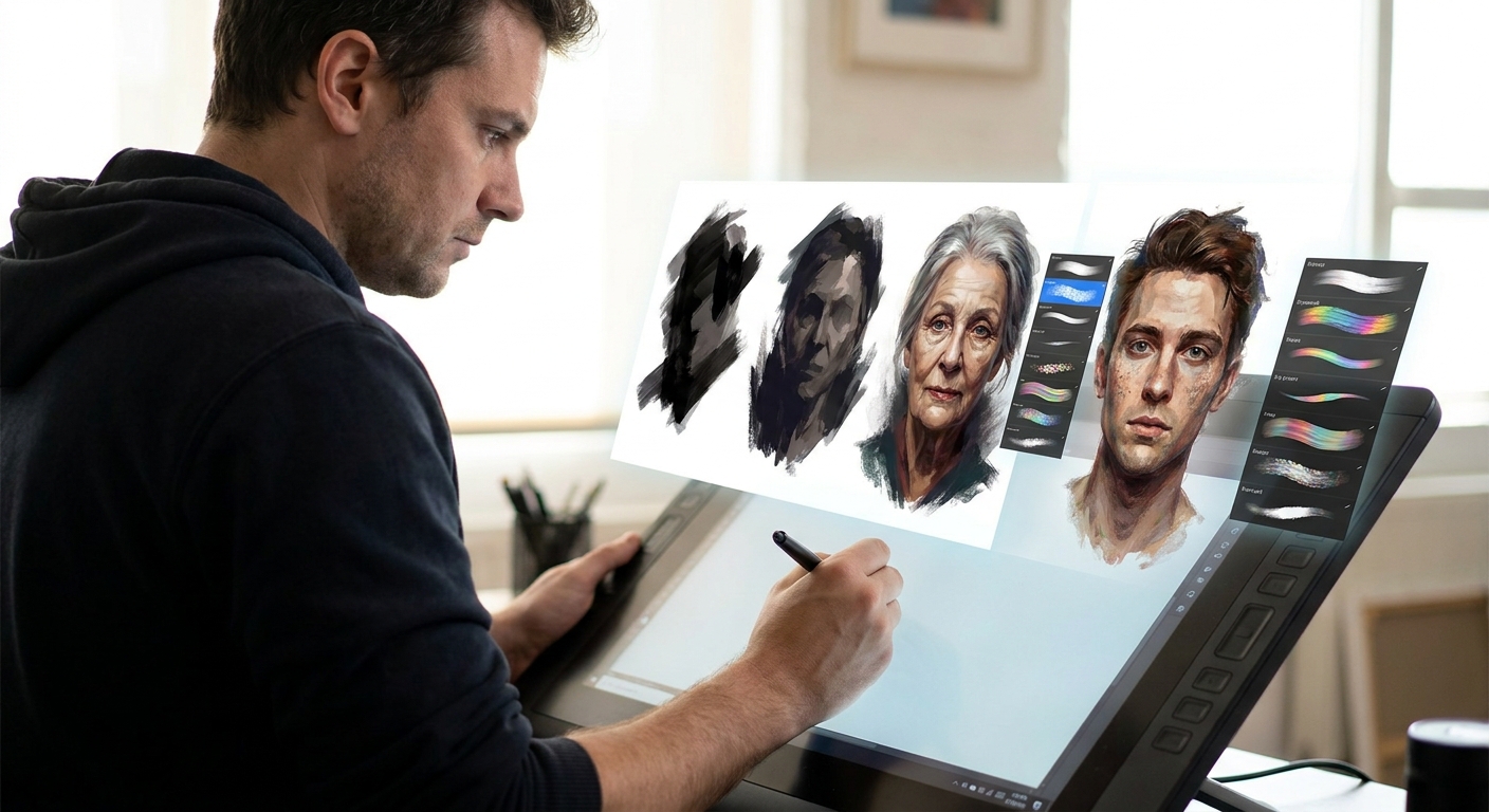
4. The Painter
Use this for volume and rendering.
Settings:
- Shape: soft or semi-hard round, light texture
- Opacity: 10–40%, pen pressure on
- Flow: 60–100%
This brush should blend nicely without getting muddy.
5. The Texture Accent
Use this sparingly for fabrics, scars, grime, etc.
Settings:
- Shape: irregular, grainy
- Opacity: 20–60%
- Scatter: low to medium
This brush is for suggesting detail, not painting every thread.
Setting Up in Your Favorite Software
Procreate
- Duplicate a default 6B Pencil → adjust grain for your gesture brush.
- Use Studio Pen or Ink Bleed as your inker base.
- Save a Flat Fill brush with no pressure size, max opacity.
- Start with Hard Round Pressure Size for line art.
- Use Soft Round Pressure Opacity for painting.
- Turn on Smoothing around 10–20% for neater strokes.
- Use Design Pencil or Mechanical Pencil for sketching.
- The G-Pen is a strong base for line work.
- Register each as a Sub Tool with clear names:
CD_Gesture,CD_Line, etc. - Use Basic-5 Size for line, Pencil-2B for sketch.
- Build a custom soft paint brush with light texture.
Photoshop
Clip Studio Paint
Krita
Name and group your tools under a brush preset named something like “Character Kit” so they’re always at hand.
Mini-Project 1: Three Personalities, Same Line Art
We’ll explore how brush and paint choices change character feel.
Step 1: Neutral Line Drawing
- Sketch and clean up a neutral character: standing pose, simple clothes.
- Keep the expression and pose fairly calm.
- Use your inker brush for consistent, mid-weight line art.
Duplicate this line art layer three times.
Step 2: Soft & Friendly Version
- Brushes: Gesture pencil, soft painter.
- Colors: Pastels or desaturated mids.
- Technique:
- Use soft edges around cheeks and hair.
- Avoid harsh shadows; use gentle gradients.
- Round off corners in hair and clothing.
Ask: Does the character feel approachable? If not, soften line weight and edge transitions.
Step 3: Sharp & Dangerous Version
- Brushes: Hard-edged inker, harsher textured brush for shadows.
- Colors: High contrast; saturated accents (red, neon, etc.).
- Technique:
- Sharpen hair tips and folds.
- Use hard, angular shadows on face.
- Add sharp highlights on metal or eyes.
See how the exact same drawing changes vibe from just brush + rendering.
Step 4: Rough & Weathered Version
- Brushes: Grainy pencil, texture accent, low-opacity painter.
- Colors: Dusty, earth tones, worn fabrics.
- Technique:
- Break your lines slightly—let them be imperfect.
- Use texture brushes at low opacity for subtle grit.
- Add rough edge lighting, not too clean.
You’ve now built three personalities with the same foundation.
Mini-Project 2: Brush-Driven Material Study for Costumes
Different materials = different brush behavior.
Step 1: Create a Material Grid
Make a new canvas, divide it into a 3x3 grid.
Label:
- Leather
- Metal
- Cloth
- Fur
- Skin
- Wood
- Glass
- Hair
- “Magic”/Energy
Step 2: Assign Brush Combos
For each square, use a different combination of your painter + texture brush.
Examples:
- Leather: painter (mid opacity) + subtle grain texture, sharp highlight.
- Metal: painter (low opacity) + hard-edged eraser for crisp shine.
- Cloth: softer blend, minimal highlights.
- Fur: small, directional strokes with texture brush.
Step 3: Tiny Character Test
- Draw a simple cloaked figure.
- Duplicate them 4–5 times.
- On each, change the costume material using your grid notes.
Notice how the same design can feel sci-fi, fantasy, or contemporary just by brushwork and rendering.
Line Weight as a Storytelling Tool
Beyond clean outlines, line weight can hint at:
- Where light is coming from
- What’s closer to camera
- Which parts are most important
- Thicker lines: closer forms, shadowed edges, weight-bearing areas (feet, hands pushing down).
- Thinner lines: distant forms, light-facing edges, decorative details.
Quick Rules
Exercise: Weight Focus
- Take an old character drawing.
- On a new layer, re-ink just the contour with varied line weight.
Make lines:
- Thicker around the torso and legs - Thinner around hair wisps and small accessories
Turn your old line layer on and off—see how much more dimensional and intentional the new one feels.
Building Your Personal Character Brush Kit
You don’t need 200 brushes. You need 8–12 you know deeply.
Suggested Kit Structure
- 2 Sketchers (light, dark)
- 2 Inkers (smooth, rough)
- 2 Painters (soft, textured)
- 2 Texture/FX (grit, special effects like glow)
Naming Convention
Name them by role and feel, e.g.:
CD_Sketch_SoftCD_Sketch_GritCD_Line_CleanCD_Line_RoughCD_Paint_SoftCD_Paint_Texture
Practice Routine
Week 1: Only use CD_Line_Clean and CD_Paint_Soft.
Week 2: Swap paint to CD_Paint_Texture, see what changes.
Week 3: Introduce CD_Line_Rough for specific character types (mercenaries, monsters, etc.).
You’ll start to associate certain brushes with certain archetypes, which speeds up design decisions.
Final Thoughts: Experiment Like a Scientist, Play Like an Artist
When you test brushes, treat it like an experiment:
- Change one variable at a time (opacity, texture, size behavior).
- Take notes on how it changes the mood.
- Save versions that feel good.
- Break your own rules.
- Use the wrong brush on purpose (inking with a chalk brush, painting skin with a grunge stamp).
- See what accidents turn into new styles.
But also give yourself “play sessions” where you:
Your brush settings are not a secret formula you must discover once and never touch again. They’re knobs you get to turn to match each character’s personality.
The more fluently you control them, the more your characters will look—and feel—exactly the way they do in your head.