You don’t get good at color by memorizing diagrams of the color wheel; you get good by lifting color, again and again, in small, repeatable exercises.
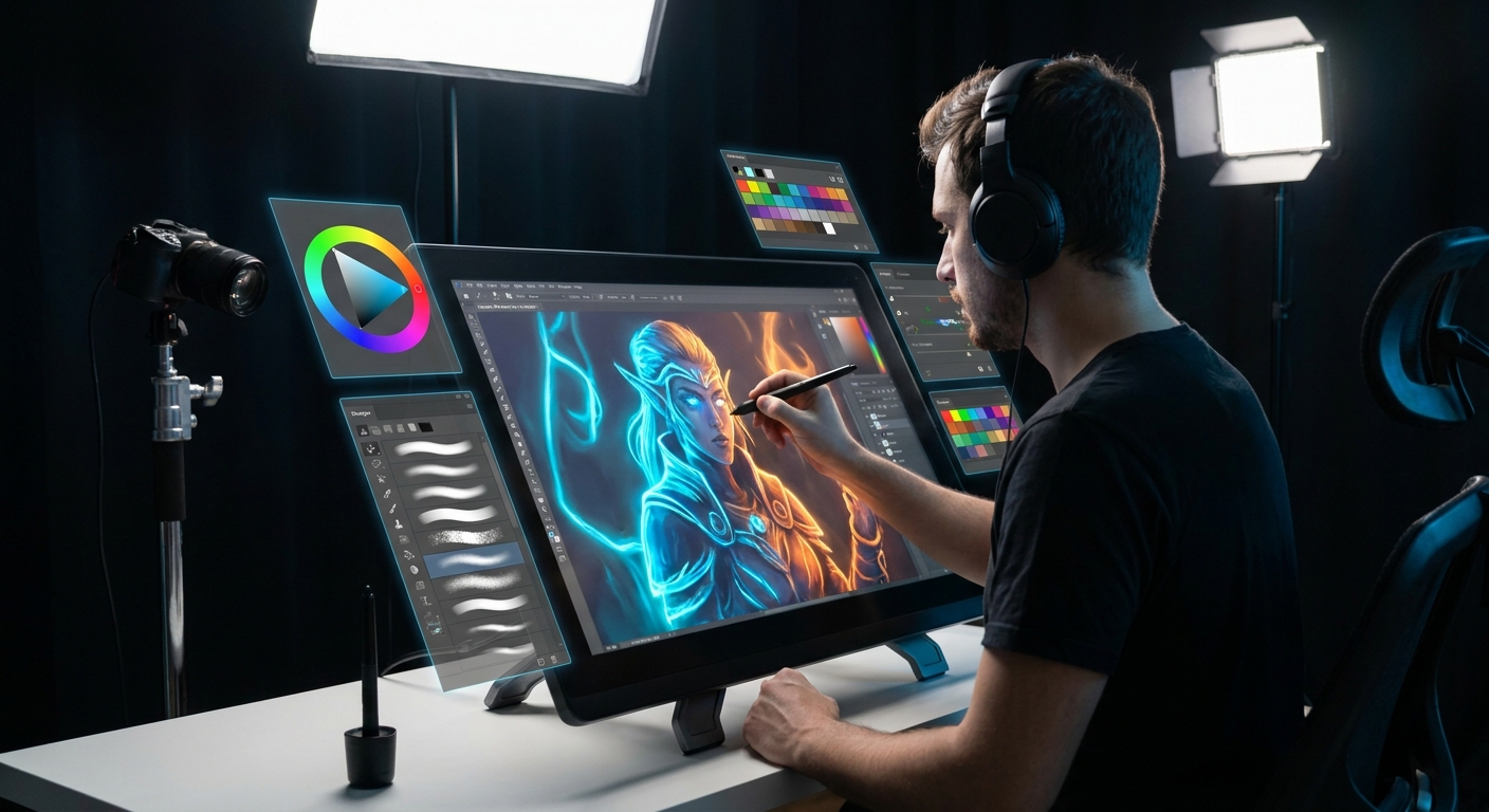
Welcome to the Color Gym
This is your Color Gym: 10 short, practical "workouts" you can do in almost any painting software.
Recommended tools: Photoshop, Procreate, Clip Studio Paint, Krita, or similar.
Set a timer for 15–30 minutes per exercise. The goal is reps, not masterpieces.
Workout 1: Grayscale to Color Sprint
Goal: Separate value decisions from color decisions.
- Create a 1500x1500px canvas.
- Paint a simple still life or bust in grayscale only.
- On top, add a new layer set to Color blend mode named
Color Wash. - With a soft brush (Opacity 60–80%), glaze colors over your values.
Focus on:
- Keeping your values visible.
- Adjusting the
Color Washlayer opacity if things get too intense. - Use Transfer ON, Flow 50–70%, so your pen pressure subtly changes intensity.
Brush tip:
Workout 2: 3-Color Character Challenge
Goal: Learn to do more with less.
Pick 3 colors only:
- 1 skin/base tone - 1 accent (hair, clothing) - 1 background 2. Paint a character bust using only those 3. You can mix by sampling from edges, but don’t add new hues.
Rules:
- You may vary value and saturation by using soft Eraser or painting with lowered opacity, but stick to those source hues.
You’ll start noticing how slight shifts in value and saturation dramatically change the feel of a color, even when hue stays nearly fixed.
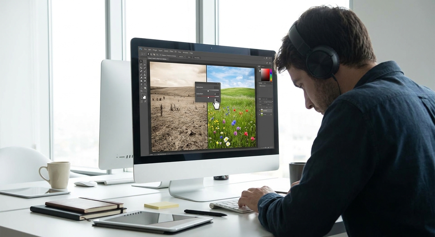
Workout 3: Temperature Flip Study
Goal: Understand warm vs cool lighting.
- Find a simple photo ref with clear light (a face, a still life).
Paint two tiny thumbnail studies (~800px wide each):
- Left: Warm light, cool shadows. - Right: Cool light, warm shadows.
Process:
- Start with a mid-grey background.
- Block in your object.
- On a new Multiply layer, paint shadows.
- On a new Overlay/Soft Light layer, paint the light color.
- Opacity: 20–40%
- Flow: 30–50%
Keep brushes soft and broad:
Compare the thumbnails and feel how the mood changes with just temperature flips.
Workout 4: 5-Value, 5-Color Limit
Goal: Simplify complex scenes.
- Create 5 swatches of value: from near-black to near-white.
- Create 5 hues you like.
- Only paint using these 10 building blocks.
Practical setup:
- Make a
Palettelayer with 10 squares. - Eyedropper them as you work.
Try painting a landscape or room interior. This forces you to design with limitation, which often produces cleaner, more graphic color statements.
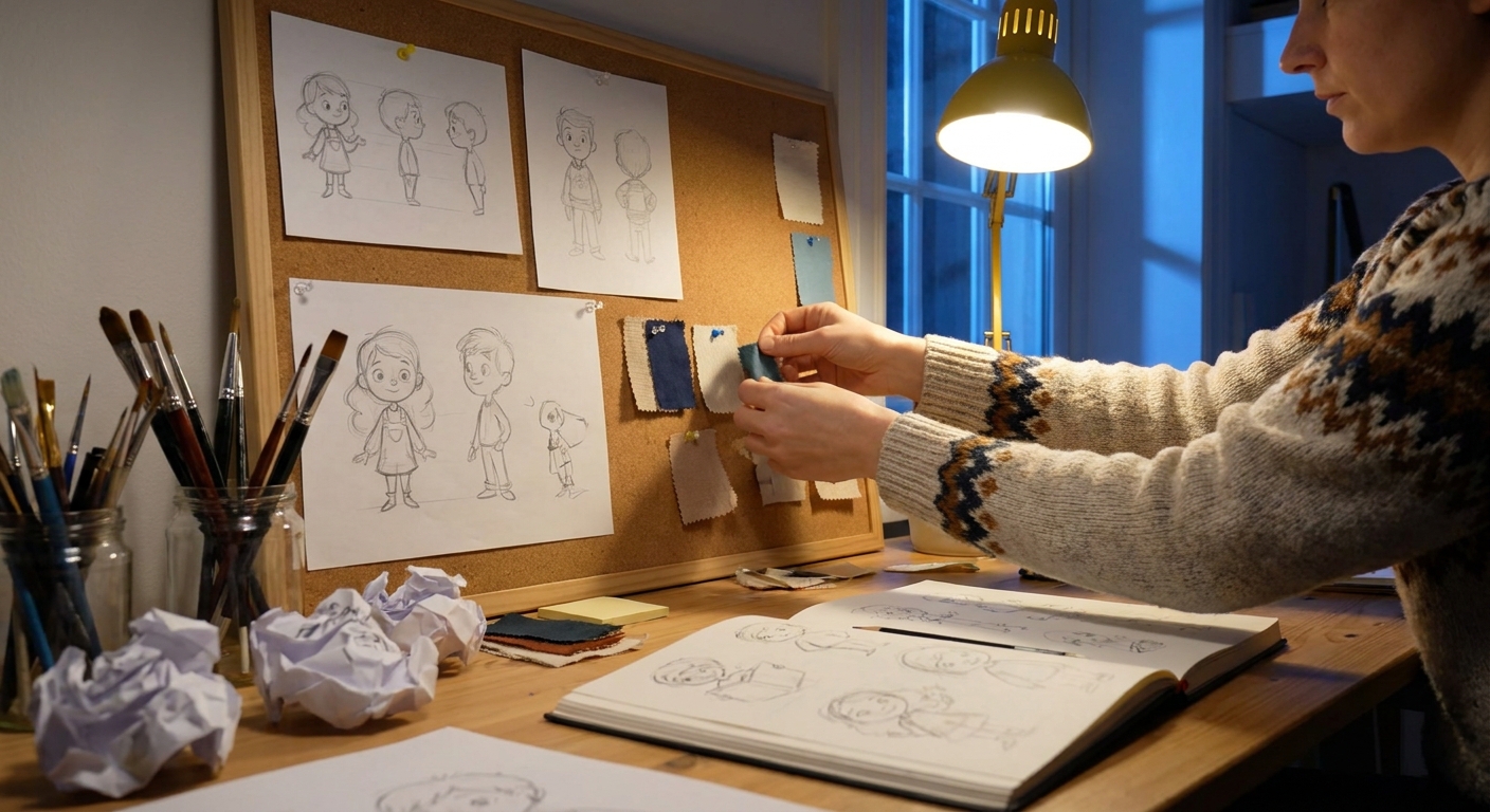
Workout 5: Mood Boards in Miniature
Goal: Connect color with emotion.
- Make a new canvas with 6 rectangles or circles.
- For each, choose a mood word: calm, angry, nostalgic, eerie, romantic, sterile.
- Fill each shape and its immediate background with only color—no drawing.
Use:
- Analogous schemes (neighboring hues) for calm.
- High saturation and complements for angry.
- Desaturated, low contrast for nostalgic.
Think like a movie colorist: how would this frame feel at a glance?
Workout 6: Edge Discipline Drill
Goal: Stop over-blending and keep color clean.
- Take any previous painting that feels mushy.
- Duplicate it; work on the copy.
- Zoom into one problem area only (e.g., cheek/jaw, shoulder/background).
Use three brushes:
- Hard Block-In (Opacity 100%, Flow 80–100%)
- Soft Blend (Opacity 20–40%, Flow 20–40%)
- Detail (small, textured, Opacity 70–100%)
- 70% of the time, use the Hard Block-In brush.
- Only use Soft Blend at transitions that truly need it.
Rules:
You’ll see colors become more vibrant and planes read more clearly.
Workout 7: Timer-Based Color Thumbnails
Goal: Improve color decision speed.
- Set a timer for 5 minutes per thumbnail.
- Draw 4–6 rough boxes.
For each box:
- Drop in a background color. - Place 2–3 large shapes of contrasting colors.
Think about:
- Warm vs cool.
- Light source color.
- Focal point saturation.
Stay abstract. Don’t render. At the end, pick your favorite and ask: Why does this one feel best? Maybe it has better value contrast, or more unified hues.
Workout 8: Color Picking From Masters (But Smarter)
Goal: Decode how great artists use color.
- Import a painting you love into your software.
- Add a layer on top and scribble notes.
Use the Eyedropper to sample:
- Light areas - Shadow areas - Focal point - Background
Observe:
- Is the background more desaturated than you thought?
- Are shadows more colorful than expected?
- Paint a tiny study (no details) using your own shapes but the same palette.
Now the key step:
Try to match their color relationships, not their drawing.
Workout 9: One Layer, No Undo
Goal: Build confidence and decisiveness with color.
- Create a new canvas.
- Use only one painting layer.
- Disable or mentally ignore Undo (or limit to 3 undos).
Paint a simple subject:
- A fruit still life.
- A small portrait.
- A creature.
- Opacity: 80–100%
- Flow: 70–100%
- Clear shapes.
- Committing to colors.
- Adjusting on the fly with new strokes instead of endless tweaking.
Use a brush with:
Focus on:
You’ll make mistakes—and learn to fix them with smarter color choices.
Workout 10: Palette Remix Session
Goal: Explore how palette alone can rewrite a story.
- Take a grayscale painting or line art.
- Make three copies of the file.
On each, build a different color story:
- Version A: Warm sunset palette (oranges, pinks, purples). - Version B: Cold sci-fi palette (cyans, blues, magentas). - Version C: Natural daylight, mid-saturation.
Use:
ColorandOverlaylayers for broad washes.- Direct painting for local adjustments.
Notice how the same drawing becomes a different narrative with each palette.
How to Use the Color Gym Long-Term
Treat these workouts like a rotation:
- Week 1: Workouts 1–3.
- Week 2: Workouts 4–6.
- Week 3: Workouts 7–10.
Repeat, shuffle, or combine them. Keep a folder named Color Gym and date each session.
Over time, you’ll feel subtle shifts:
- You’ll pick better base colors faster.
- You’ll know when something feels "off" and which knob (value, saturation, temperature, edges) to twist.
Color theory stops being abstract and becomes muscle memory—built one small workout at a time.