Muddy color isn’t a sign you’re bad at art; it’s a sign you’re pushing into more complex territory. Mud happens when value, saturation, and temperature are all fighting each other. The good news: in digital painting, you can fix it fast—with intention.
Why Your Colors Look Muddy (And Why That’s Actually Good News)
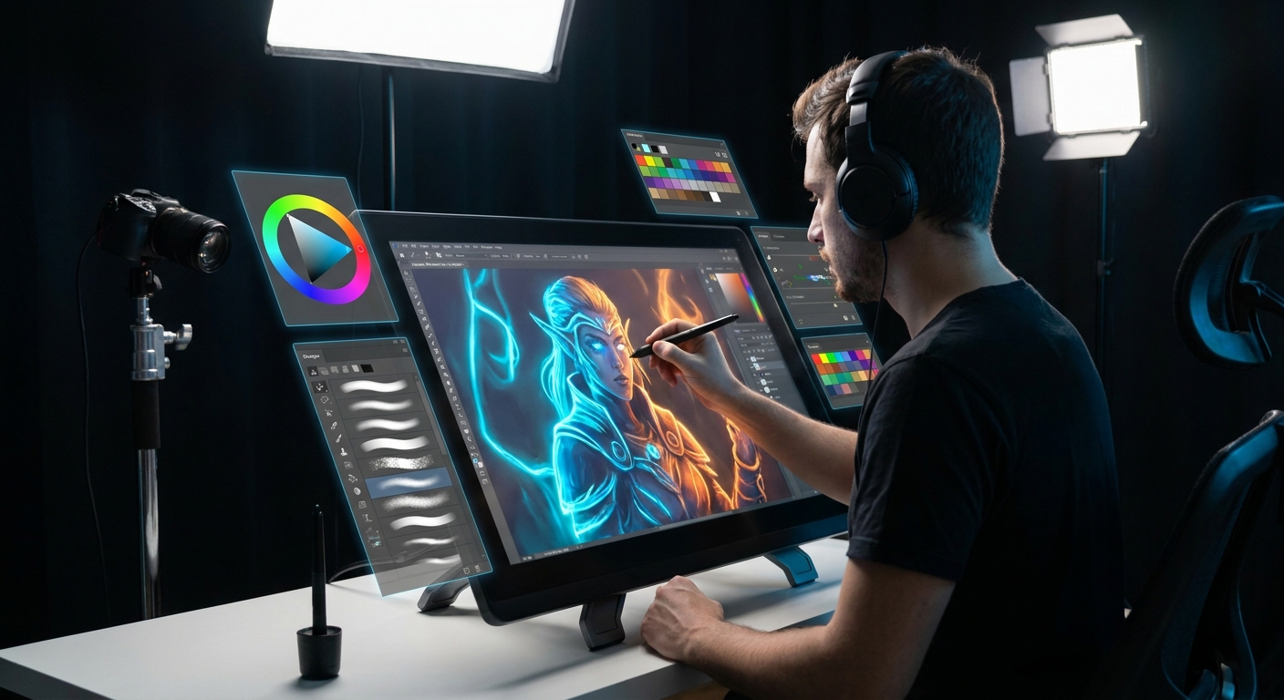
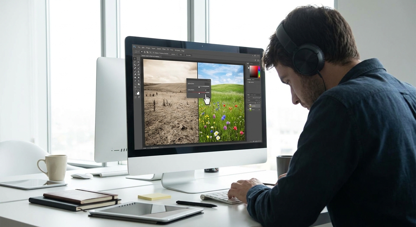
This article is a hands-on repair guide: we’ll take common color problems and walk through concrete fixes using layers, blend modes, and smart brush settings.
Tweak 1: Separate Value From Color
Muddy paintings often have unclear value structure. Everything hovers in the same midtone.
Diagnosis
Do this on any piece you suspect is muddy:
- Add a Hue/Saturation adjustment layer.
- Drag Saturation to -100.
- Toggle the layer on/off.
If your image flattens into a grey soup, your values are too similar.
The Fix
- Make a new layer called
Value Checkon top. - Fill it with pure black and set blend mode to Color.
- Paint directly on your original layers, not the Value Check.
Now you’re seeing values only.
- Push shadows darker and lights lighter, especially near the focal point.
- Use a Hard Round / solid brush:
- Opacity: 80–100%
- Flow: 60–80%
- Pen pressure: Size only
Once the value structure reads, your colors—whatever they are—will start to feel more intentional.
Tweak 2: Control Saturation Like a Spotlight
Another cause of mud: everything is equally saturated.
Visual Framework: Saturation Hierarchy
Imagine your painting as a stage:
- Lead actor: small area of highest saturation.
- Supporting cast: medium saturation.
- Background extras: desaturated.
Practical Exercise
- Duplicate your artwork layer (or group) and name it
SAT TEST. - On
SAT TEST, open Hue/Saturation. - Drag Saturation up to silly levels and see where saturation is strongest.
Ask yourself: Is the most saturated area where I want the viewer to look first?
If not:
- Add a Hue/Saturation adjustment layer clipped to the background.
- Lower saturation by 20–40.
- For the focal point, add another Hue/Sat layer and nudge saturation up slightly.
- Paint backgrounds with lower saturation and often higher value.
- Keep sharp, intense colors near key shapes: faces, eyes, important objects.
In brush work:
Tweak 3: Warm Light, Cool Shadows (And Vice Versa)
When light and shadow temperature are too similar, everything blends into mush.
Quick Temperature Test
- Use the Eyedropper on a lit area.
Look at the color wheel: is it slightly warm or cool?
3. Sample a shadow area. Is it the same temperature direction? If yes, that’s part of the mud.
The Fix With Layer Modes
- Create a new layer named
Shadows. - Set it to Multiply.
- Choose a cool color (blue-violet, teal) if your light is warm.
Use a large, soft brush:
- Opacity: 15–30% - Flow: 20–40%
Gently glaze over shadow regions. Adjust layer opacity.
- Create another layer called
Lights. - Set to Overlay or Soft Light.
- Choose a warm tone (yellow, orange, peach).
- Lightly brush over lit areas.
The subtle warm–cool opposition makes even simple colors feel rich and intentional.
Tweak 4: Clean Edges for Cleaner Color
Messy edges and over-blending are sneaky contributors to muddy color.
The Brush Problem
If you always use:
- a super-soft brush,
- low opacity (10–20%),
- and constantly sample from the canvas,
you’re mixing all your colors into a brownish soup.
The Brush Solution: Three-Brush System
Use three clear roles instead of one do-it-all brush.
Block-In Brush (Shape & Color)
- Hard Round or flat, minimal texture. - Opacity: 80–100% - Flow: 80–100% - Purpose: lay in solid color shapes.
Blend Brush (Limited Use)
- Soft Round / textured smudge. - Opacity: 20–40% - Flow: 20–40% - Purpose: only soften edges where needed.
Detail Brush (Accents & Edges)
- Smaller, slightly textured. - Opacity: 70–100% - Flow: 60–90% - Purpose: refine key edges and accents.
Edge Study Exercise
Pick one area of your painting that feels mushy (e.g., cheek to background transition):
- Use your Block-In Brush to repaint major shapes with clear edges.
- Use Blend Brush only where a real soft transition exists (like a cast shadow fading).
- Leave many edges sharp; let your colors sit next to each other instead of merging.
Colors often become more vibrant when you allow them to meet cleanly instead of being blended into oblivion.
Tweak 5: Use Gradient Maps to Rescue Color
Sometimes, repainting everything is overkill. Gradient Maps can rewire the color logic over your existing values.
What’s a Gradient Map?
A Gradient Map remaps your darkest darks and lightest lights (and everything in between) to colors of your choosing.
How to Use It (Photoshop / Krita / CSP)
- Add an Adjustment Layer → Gradient Map on top of your painting.
- Click the gradient bar to edit.
Set 3–5 points:
- Leftmost (shadows): deep cool (navy, purple, teal). - Midtones: neutral or slightly warm. - Highlights: warm (cream, pale yellow, peach). 4. Set the Gradient Map layer to Soft Light, Color, or Overlay. 5. Lower opacity to 20–60%.
Instantly, your values inherit a more unified color logic.
In Procreate
- Use Gradient Map under Adjustments (wand icon).
- Apply as an Adjustment on a duplicated flattened version.
- Experiment with built-in gradients, then make your own.
Hands-On Repair Session: A 20-Min Workflow
Try this on a muddy piece you’re not satisfied with:
5 min – Value Check
- Add a black Color layer to preview values. - Push darks and lights where needed.
5 min – Temperature & Saturation
- Add Multiply (cool shadows) and Overlay (warm lights) layers. - Adjust saturation hierarchy with a couple of Hue/Sat layers.
5 min – Edges
- Switch to your three-brush system. - Re-establish sharp vs soft edges.
5 min – Gradient Map Polish
- Add a Gradient Map adjustment to harmonize colors. - Lower opacity until it feels natural.
You’ve just given your color a mini spa day.
Turning "Mistakes" Into Color Studies
Instead of deleting muddy pieces, duplicate them and treat them as experiments:
- Version A: Fix only value.
- Version B: Fix only saturation.
- Version C: Go wild with temperature.
Compare the three. Which change improved it the most? That’s where your color weakness currently lives—and where your practice should focus.
Mud isn’t the enemy; it’s feedback. Use these five tweaks as a toolkit, and every "ruined" painting becomes color theory class in disguise.