Every illustration tells a story, and color is the silent co-author whispering in your viewer’s ear. Before you obsess over the "perfect" teal, ask what role your colors play in the narrative.
Color as Your Co-Author
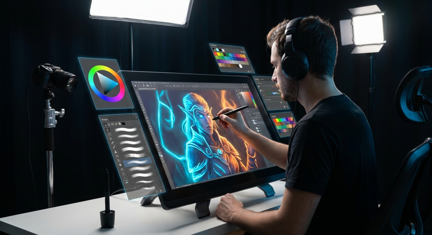
This guide walks you through designing story-driven color palettes for digital art. We’ll build palettes step-by-step, plug them into thumbnails, and use software tricks to keep everything flexible.
Step 1: Write a One-Sentence Color Brief
Instead of starting with a color wheel, start with words.
Ask:
- What is happening in this scene?
- How should it feel at first glance?
- "A cozy witch in a cluttered attic, lit by warm candlelight, with stormy blues outside."
- "A lonely astronaut on a cold, abandoned station, with harsh cyan light and small red warnings."
Example briefs:
Write yours down. That’s your color brief.
Step 2: Translate Words Into Color Axes
Break your brief into 3 axes:
Temperature: Mostly warm? Mostly cool?
Saturation: Muted? Vibrant? A mix?
Value: Mostly dark? Mostly light? Strong contrast?
For "cozy witch in attic":
- Temperature: warm interior vs cool exterior.
- Saturation: medium with pockets of high saturation in magic glows.
- Value: dark room with bright, warm focal points.
Write these as simple notes in your canvas margins.
Step 3: Build a Base Palette in Software
Create a small palette strip at the side of your canvas.
Suggested Layer Setup
Palettelayer at the top or on the side.- Lock it to avoid accidental painting.
Now choose:
Ambient Color (the air color)
- For the attic: a deep, slightly desaturated brown-red.
Key Light Color
- Warm, soft yellow-orange for candles.
Shadow Color
- A cooler, desaturated purple-brown to contrast the light.
Accent Color(s)
- A saturated blue or turquoise for magical glows. - Maybe a pop of green for plants or bottles.
Use HSB/HSL sliders:
- Keep ambient, light, and shadow in similar saturation ranges.
- Let accents break the rule with higher saturation.
Paint swatches as big rectangles you can easily Eyedropper.
Step 4: Palette Thumbnails – Story Before Detail
Before diving into the final illustration, do 3–6 tiny thumbnails using only big color blocks.
- Create a canvas with 3–6 small rectangles (400–600px wide each).
- Roughly draw your composition in 1–2 values.
- On a new layer set to Color or Normal, fill in your palette colors.
Focus on:
- Where warm vs cool happens.
- Where the brightest and darkest values meet (usually your focal point).
- Where accent colors appear.
Spend 5–10 minutes per thumbnail. No rendering. Think like a film color script artist.
Step 5: Use Layer Modes to Enforce Palette Logic
Once you choose a favorite thumbnail, scale it up or redraw it and keep your palette logic baked in.
Step-by-Step Layer Workflow
Base Values
- Paint the scene in grayscale on a Values group.
Global Palette Wash
- Above Values, add a Global Color layer set to Color. - Fill broad regions: - Interior walls with your ambient color. - Window light with sky color. - Characters with rough local colors.
Lighting Layers
- Light layer (Overlay/Soft Light): paint key light color. - Shadow layer (Multiply): paint your chosen shadow color.
Brush settings for these washes:
- Large soft brush.
- Opacity: 15–40%.
- Flow: 20–50%.
Now you’ve built a color scaffold: your story-driven palette sits on top of solid values.
Step 6: Manage Palette Consistency With Clipping Masks
As you render, it’s easy to accidentally drift into random colors. Clipping masks help keep you tethered to your palette.
Example: Coloring the Witch’s Outfit
- Paint a flat silhouette of her outfit in one midtone color on
Base Outfitlayer. - Above it, create
Shadows,Lights, andLocal Color Variationslayers clipped toBase Outfit.
On Shadows (Multiply):
- Use your palette’s shadow color.
- Let the underlying base color tint it.
- Use your light color.
- Stay near your chosen palette hues; use the Eyedropper often.
On Lights (Overlay/Soft Light):
On Local Color Variations (Normal):
This system keeps every zone in the illustration locked into the global palette logic.
Step 7: Accent Color Placement – The Viewer’s Eye Guide
Accent colors should function like signposts for the story.
For the cozy witch scene:
- Use bright turquoise only on:
- The potion in her hand.
- A magic glyph on the floor.
Everywhere else, keep blues and greens subdued.
Practical tip:
- Put your accent color on its own layer (e.g.,
Magic Glow) so you can nudge hue/saturation without wrecking the rest. - Soft round with a gentle falloff.
- Opacity: 20–50%.
- Flow: 30–60%.
- Add a sharper highlight with a small hard brush.
Brush suggestions for glows:
Step 8: Color Feedback Loop – Checking Your Story
Periodically, zoom out and ask:
- If I blur my eyes, does the warm/cool split still read?
- Is my focal point also where the strongest color contrast lives?
- Do any random saturated colors pull attention away from the story?
Helpful Adjustment Layers
- Hue/Saturation:
- Desaturate entire background slightly if it competes with the character.
- Color Balance:
- Push shadows cooler, lights warmer to reinforce mood.
- Selective Color (Photoshop):
- Nudge specific color ranges (e.g., make all reds slightly more orange for warmth).
Use adjustment layers non-destructively; you can always dial them back.
Step 9: Time of Day & Story Beats Variations
Story-driven color shines when you explore what-if scenarios.
Take your cozy witch scene and create 3 versions:
Dawn
- Cooler, soft blue light from the window. - Weak, pale candlelight. - Palettes: soft, low contrast.
Noon
- Strong white-yellow light slicing through the room. - Harsh shadows; broom bristles glowing.
Midnight Ritual
- Deep blue/black ambient. - Strong warm candle clusters. - Magical glows more visible.
You can do this quickly:
- Group your painting layers.
- Duplicate the group 3 times.
- On each group, add Color Balance / Gradient Map adjustments to push toward a new palette.
You’re practicing storyboarding with color.
Step 10: Build a Personal Palette Library
Every strong palette you create is a future time-saver.
How to Save Palettes
- Photoshop / Krita / CSP:
- Create a separate document
Palette_Library.psd. - Each scene gets a labeled color strip and brief notes.
- Procreate:
- Create a new Palette collection per project.
- Name them descriptively:
Cozy Attic Warm/Cool,Cold Sci-Fi Deck. - Ambient color.
- Light color(s).
- Shadow color.
- Accent color(s).
- "Use accent only near character’s hands."
- "Background always desaturated vs characters."
Include small swatches for:
Jot notes like:
Your future self will thank you when starting new illustrations.
Putting It All Together
Story-driven palettes are less about rigid rules and more about consistency with intent:
- Decide what the illustration is about emotionally.
- Translate that into temperature, saturation, and value decisions.
- Build a palette that reflects those decisions.
- Use layers, masks, and adjustments to stay loyal to the palette.
The next time you open a blank canvas, don’t start by spinning the color wheel at random. Start by writing one sentence about the scene. Let that sentence choose your colors for you.
Color theory stops being an abstract concept and becomes what it was always meant to be: a storytelling tool you wield on purpose.