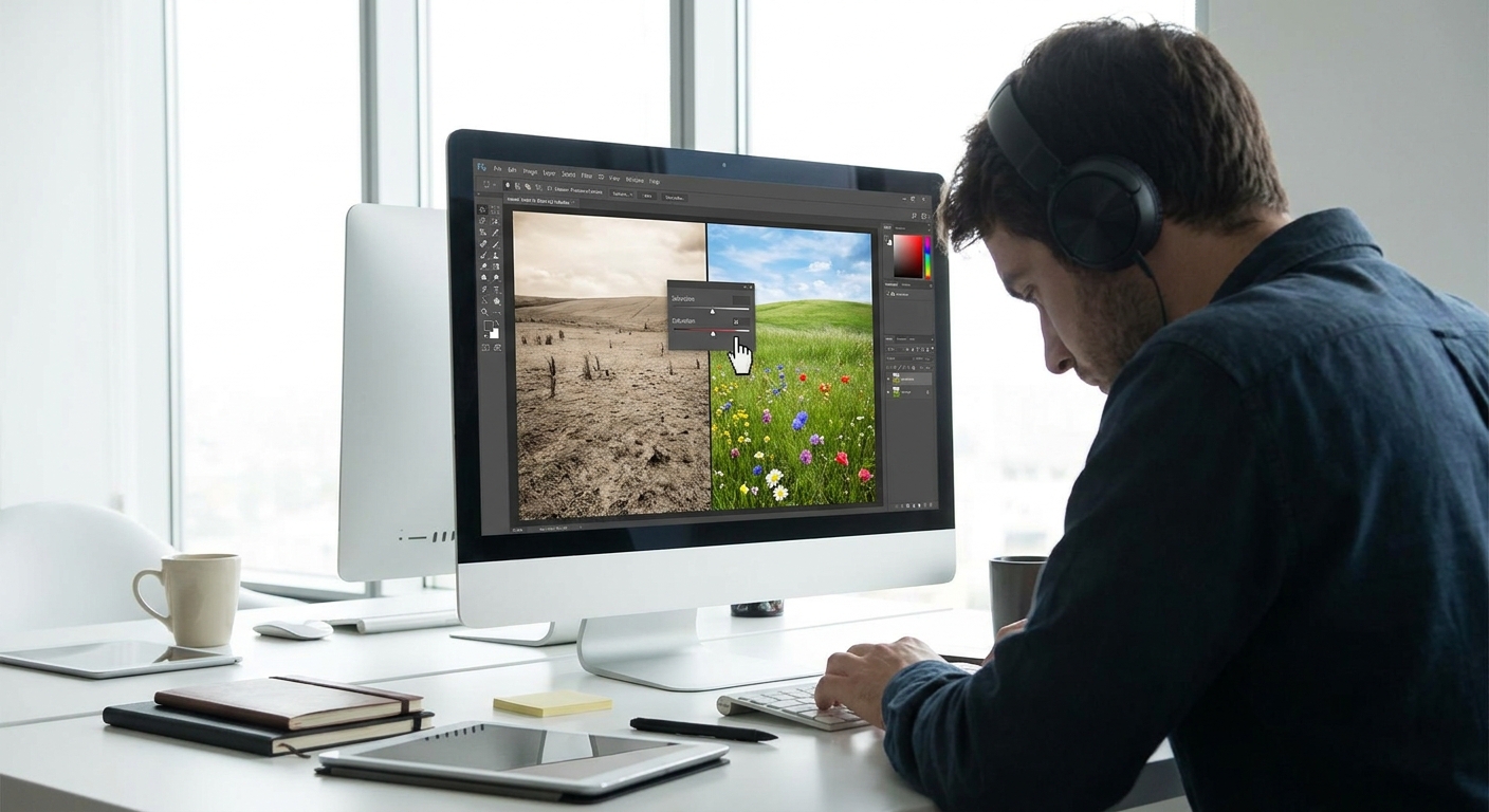
Color theory isn’t a rulebook you’re supposed to obey; it’s a playground you’re invited to explore. As a digital artist, you can test ideas instantly: change a hue, tweak saturation, push contrast, hit Undo. This makes digital painting the perfect lab for learning color.
Introduction: Color Theory as a Playground
In this workshop-style guide, we’ll walk through practical color theory you can test in your software today—Photoshop, Procreate, Clip Studio, Krita, or anything with layers and a color wheel.
Step 1: Start With a Limited Palette (The 3-Color Challenge)
Think of a limited palette as training weights for your eyes.
The Exercise
- Create a new canvas (around 2000–3000px on the long side, 300 dpi for painting comfort).
Pick three base colors:
- One warm (e.g., a muted orange) - One cool (e.g., a desaturated blue) - One neutral (e.g., a grey leaning warm or cool) 3. Lock yourself to these three colors for one painting session.
How to Set It Up in Software
- Photoshop / Krita / CSP:
- Create a new layer named
Paletteand paint three swatches. - Use the Eyedropper (I) to pick from them as you work.
- Procreate:
- Add a new Palette in the Color panel.
- Long-press to pick your colors and tap in the palette slots.
Mixing Colors Digitally
Instead of adding new colors from the wheel, mix from your three:
- Use a Soft Round brush with low opacity (20–40%) and sample between colors.
- Or use the Smudge tool (set to a textured brush) to blend edges.
- Hard-Edged Painterly Brush
- Opacity: 80–100%
- Flow: 70–100%
- Pressure: Affects size, not opacity (for confident strokes)
- Soft Mixer Brush / Blending Brush
- Opacity: 20–40%
- Flow: 20–40%
- Transfer/Opacity Jitter: Pen Pressure ON
Suggested Brush Settings (as a starting point)
This forces you to notice how value and temperature do most of the heavy lifting, long before you add fancy hues.
Step 2: Think in Value First, Color Second
Color is loud; value is structure. If the values are solid, the colors can be wild and still work.
Value-First Exercise
- Paint a simple object—an apple, a mug, a character bust—in grayscale only.
- Check that the form reads well: light, midtone, shadow, core shadow, reflected light.
- Once it works in grayscale, add color on a layer above.
Layer Setup for Easy Colorizing
- Base layer:
Values(grayscale) - Above it:
Colorset to Color or Overlay blend mode - Use a soft brush with 60–80% opacity.
- Paint local colors (red for an apple, skin tones, etc.).
- Avoid pure saturated colors at first; stay mid-saturated.
- Add a Hue/Saturation adjustment layer on top and drag Saturation to -100.
- Or create a Black & White adjustment layer.
- Toggle it on/off while you paint to see if your color choices are breaking the value structure.
On the Color layer:
Checking Your Values Quickly
Step 3: Warm vs Cool – Painting Temperature Like a Lighting Artist
Temperature contrast (warm vs cool) is your secret weapon for believable light.
Simple Lighting Rule of Thumb
- Warm light → cool shadows
- Cool light → warm shadows
Practical Test
- Paint a sphere on a mid-grey background.
- Choose a warm light source: soft yellow-orange brush on a new layer set to Soft Light.
- In the shadows, glaze in cooler tones (blue-violet) with low opacity.
Brush suggestions:
- “Soft Airbrush” or “Soft Round”
- Opacity: 15–30%
- Flow: 20–40%
Watch how the object suddenly feels more 3D and believable.
Step 4: Three Harmonies You Can Actually Use
Instead of memorizing the entire color wheel, master three practical harmonies.
1. Analogous Harmony (Neighbors on the Wheel)
- Example: Yellow → Yellow-Orange → Orange.
- Mood: calm, unified, natural.
- Pick 1–3 neighboring hues on the color wheel.
- Vary value and saturation more than hue.
- Great for landscapes and soft, atmospheric pieces.
- Example: Blue & Orange, Red & Cyan, Purple & Yellow.
- Mood: dramatic, high contrast.
- Choose one as dominant (70–80%) and the other as an accent.
- Use the complement in the focal area (eyes, main object, center of interest).
- Example: Blue, Yellow-Orange, Red-Orange.
- Choose your main hue.
- Use the two hues that sit on either side of its complement.
- This gives you color contrast without looking garish.
How to Use:
2. Complementary Harmony (Opposites)
How to Use:
3. Split-Complementary (Friendly Drama)
How to Use:
Most digital color pickers (Procreate, CSP, Adobe Color online) have Harmony or Color Guide modes to auto-generate these.
Step 5: Build a Simple Color Script (Visual Thinking Framework)
Before painting a full scene, map its emotional beats using color.
The Mini Color Script Exercise
- Create a canvas with 4–6 small rectangles.
For each rectangle, decide:
- Time of day - Emotion (calm, tense, mysterious, joyful) 3. Use large, simple shapes of color only—no detail.
For example:
- Panel 1: Cool blue dawn → calm.
- Panel 2: Warm golden noon → energy.
- Panel 3: Greenish overcast → uneasy.
- Panel 4: Red-violet sunset → dramatic.
This teaches you to think in overall palettes instead of random color choices.
Step 6: Smart Software Tricks for Better Color
Use Adjustment Layers Like Safety Nets
- Hue/Saturation: Tweak entire color families at once.
- Color Balance: Push shadows warm, highlights cool, etc.
- Gradient Map: Turn grayscale into stylized color quickly.
Workflow:
- Paint mostly in mid-saturated colors.
At the end, add a Color Balance layer and gently nudge:
- Shadows → a bit cooler. - Highlights → a bit warmer.
Use Layer Modes for Lighting
- Multiply: Darken with color (great for shadows).
- Overlay/Soft Light: Add contrast and color to light.
- Create a
Shadowlayer in Multiply. - Paint soft blue-violet shadows; adjust opacity to taste.
- Create a
Lightlayer in Overlay. - Glaze in warm yellows for sunlight.
Example:
Step 7: Weekly Practice Routine (Color Gym)
Here’s a simple routine to build your color instincts:
Day 1 – Grayscale Study (30–45 min)
- Paint an object or portrait in grayscale only.
- Add color on a
Colorlayer. - Aim for believable skin, metals, or fabrics.
- Pick a reference (photo or painting).
- Repaint with a limited complementary palette.
- Make 4 mini-thumbnails to explore color moods.
- Break a "rule" on purpose (e.g., warm shadows with warm light) and see what you learn.
Day 2 – Colorize It (30 min)
Day 3 – Complementary Palette (45 min)
Day 4 – Color Script (30 min)
Day 5 – Free Experiment
Closing: Color Theory as a Set of Experiments
Treat every painting as a color experiment:
- What if the light is ice-blue and the shadows are red?
- What if I rely on values and barely change hue?
- What if I use only three colors plus adjustments?
Save versions of your work at different stages and compare. Over time, you’ll develop an instinctive feel for which colors feel right for your story, not just which ones look pretty on the wheel.
Your new homework: open your software, pick three colors, and paint something small. Keep it messy, keep it playful, and let color theory be your guide—not your prison.