Imagine opening your painting app, staring at a blank canvas, and actually knowing what to do first, second, and third. This walkthrough is a full digital painting tour: from idea sketch to final polish. We’ll keep it hands‑on and flexible so you can follow along in Procreate, Photoshop, Krita, Clip Studio Paint, or any other major painting app.
Introduction
You don’t need to be an expert. Think of this like a relaxed studio class: pause, experiment, and adapt each step to your style.
1. Setting Up Your Digital Workspace
Before you start painting, set the stage.
Canvas Size & Resolution
- For practice studies: 2000–3000 px on the longest side, 300 dpi
- For prints or portfolio work: 3500–5000 px on the longest side, 300 dpi
Choose RGB color mode for screens. If you intend to print later, you can convert to CMYK at the end.
Basic Layer Setup
Create these layers right away:
Background – flat color or a subtle gradient
Sketch – set to Multiply, 40–80% opacity
Base Color – under the sketch
Shadow/Light – above base color
Think of layers as tracing paper sheets. We’ll keep them simple so you don’t get lost.
2. Thumbnailing: Visual Thinking in Tiny Squares
Don’t jump into detail yet. Start with rough “thumbnails” to explore the idea.
Thumbnail Exercise (5–10 minutes)
- Create a new layer above the background.
- Draw 3–6 tiny rectangles (about 400x400 px each) or just small boxes on one canvas.
With a large, soft brush at 60–80% opacity and 50–80% flow:
- Block in simple shapes for your subject. - Ignore details; focus on silhouette and big value shapes (dark vs light).
Ask yourself:
- Can I recognize the subject in 2 seconds?
- Is the silhouette interesting?
Pick one thumbnail that feels most dynamic. That’s your blueprint.
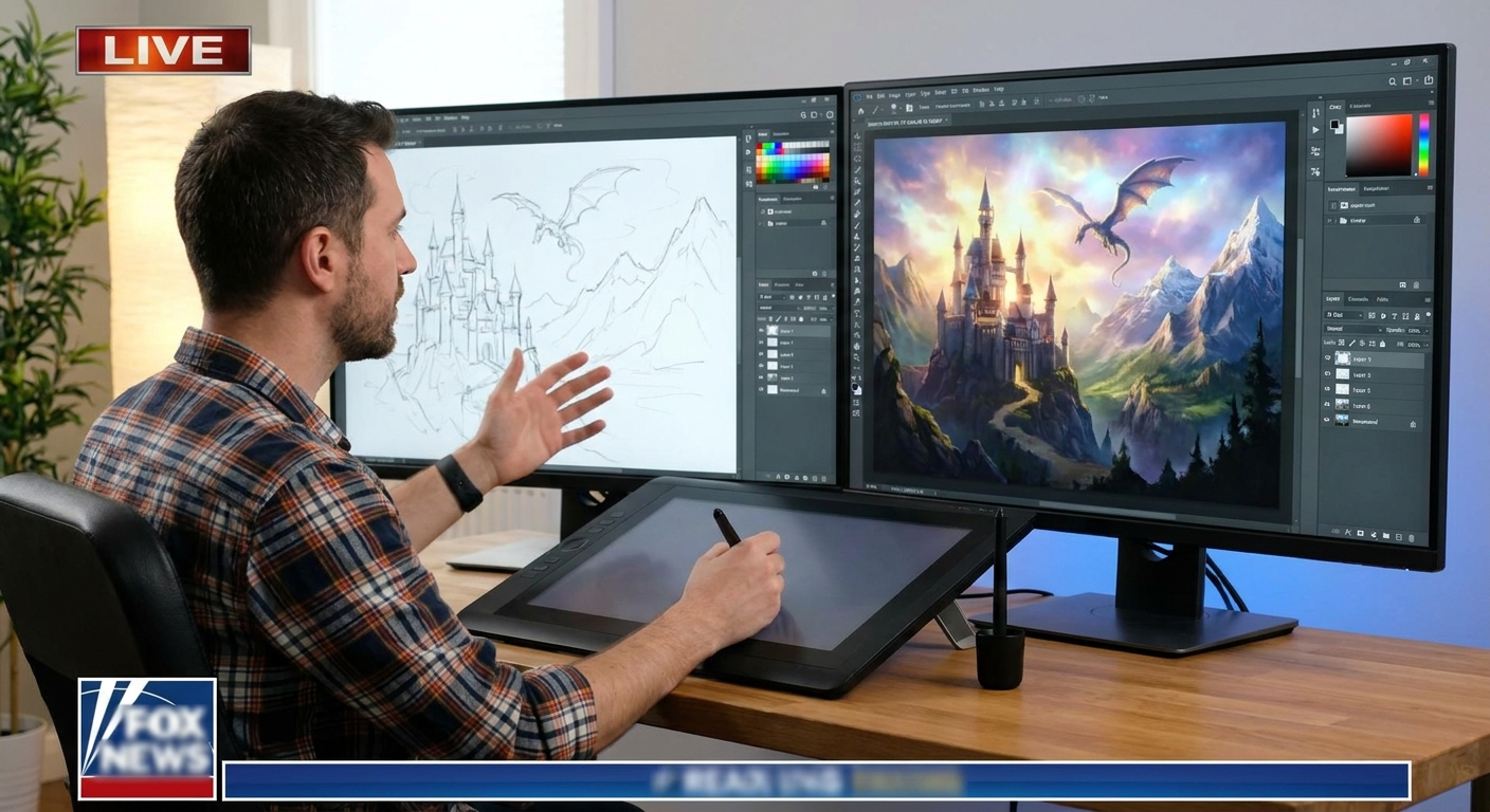
3. Sketching the Structure
Move from the chosen thumbnail into a more refined sketch.
Brush & Settings for Sketching
Use:
- A pencil‑like brush with slight texture
- Size: small enough to feel like a real pencil (2–8% of canvas width)
- Opacity: 70–100%, Flow: 50–70%
Steps
- Lower the opacity of your thumbnail layer to around 25–40%.
On the Sketch layer, draw over it:
- Emphasize major forms (head, torso, main props). - Use simple shapes: spheres, boxes, cylinders. - Don’t chase perfect lines. Think “construction,” not “final ink.”
Visual framework: gesture → structure → contour.
- Gesture: loose lines for energy and movement.
- Structure: add boxes, cylinders, perspective.
- Contour: refine main outer edges.
Stop when the drawing is clear enough to paint over, not when it’s perfect.
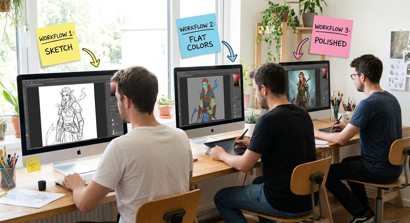
4. Blocking In Flat Colors (Local Color Stage)
Now we “color inside the lines” of the sketch.
Brush & Settings for Blocking In
- Hard round or simple opaque brush
- Opacity: 100%
- Flow: 80–100%
- Pen pressure: only affects size (turn off pressure for opacity for now)
Steps
- Lock your Sketch layer (so you don’t smudge it).
On the Base Color layer, use the Lasso tool or a big brush to fill in:
- Skin - Clothes - Background elements
Think of this as cutting out colored paper shapes. No shading yet.
Tip: Use Layer Groups
Create a group named CHARACTER and put your sketch + base color inside. This keeps your file organized as it grows.
5. Establishing Values and Lighting
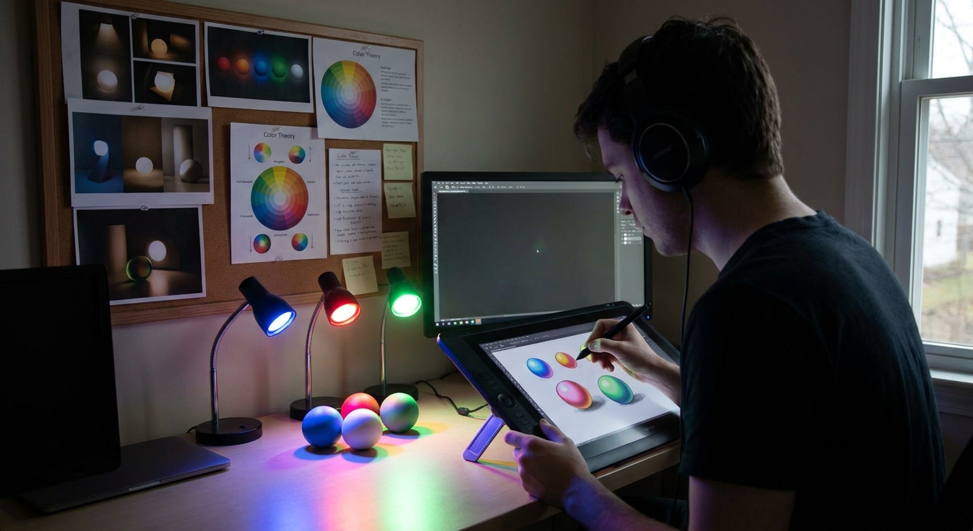
Lighting will make your painting feel 3D and believable.
Decide Your Light Scenario
Ask yourself:
- Where is the main light? (Top? Side? Back?)
- Is it soft (cloudy) or hard (sunlight/spotlight)?
Draw a tiny doodle off to the side showing a sphere and an arrow pointing to it. This becomes your lighting guide.
Creating a Shadow Layer
- Add a new layer above
Base Color. - Set blending mode to Multiply.
- Clip it to the Base Color layer (so paint stays inside shapes).
Brush settings:
- Soft round with subtle texture
- Opacity: 30–60%
- Flow: 50–70%
Start adding shadows where the light can’t reach. Use a single shadow color at first (a cool, desaturated tone works well).
Then create a Lights layer above that:
- Set to Overlay or Soft Light.
- Use a warm, light color to brush in highlights.
You now have a basic light + shadow read.
6. Blending and Form Modeling
This is where your painting starts to look “finished.”
Two Main Blending Approaches
1. Brush Blending (Painterly)
- Use a round brush with low opacity (15–40%) and flow (20–50%).
- Lightly stroke across the edge between light and shadow.
- Sample colors frequently with the eyedropper (hold Alt/Option in most apps).
This builds a smooth gradient and new nuanced colors.
2. Smudge Tool (Soft transitions)
- Use a textured smudge brush at 20–40% strength.
- Gently drag across edges where you want soft turns (cheeks, clouds, fabric).
Avoid over‑blending; keep some hard edges for structure.
Visual Framework: Edges
Think in terms of edge types:
- Hard edges: sharp corners, cast shadows
- Soft edges: slow turns in form, soft shadows
- Lost edges: when object and background blend
Ask yourself every few minutes: “Where do I need hard, soft, or lost edges?” Mixing them adds realism and focus.
7. Color Variation and Depth
Once your forms read well in grayscale, it’s time to enrich your color.
Add Color Variation
On a new layer in Color or Overlay mode:
- Gently glaze subtle shifts:
- Cooler tones in shadows
- Warmer tones in the lights
- Slight hue variation in skin, fabric, metal
- Soft, textured brush
- Opacity: 10–25%
- Flow: 20–40%
Recommended brush:
This keeps things painterly and avoids flatness.
Atmospheric Perspective (If You Have Background)
To create depth:
- Push distant objects towards cooler, lighter, and lower contrast colors.
- Keep foreground higher contrast and more saturated.
Use a large soft brush on an Adjustment layer or clipped Color layer.
8. Detailing: Focal Points First
It’s tempting to detail everything, but that can kill your composition. Instead, choose 1–2 focal points.
Common focal points:
- Face or eyes in a character
- Hands
- A bright object or area of high contrast
Detail Workflow
- Zoom into the focal area (100–150%).
Switch to a smaller, sharper brush:
- Opacity 70–100% - Flow 60–80%
Add:
- Texture hints (fabric weave, skin pores, scratches) - Small value jumps (lightest lights, darkest darks) - Clear, crisp edges where needed
Zoom out often. Your details should support the overall read, not distract from it.
9. Final Polish and Post‑Processing
This is the finishing flourish stage.
Checklist
- Flip the canvas horizontally to spot drawing mistakes.
- Use a Hue/Saturation adjustment layer to nudge colors.
- Add a subtle Color Balance or Gradient Map layer for mood.
- Gently paint over any noisy areas to unify them.
Optional: Add a slight vignette by darkening the edges of the canvas on a new layer set to Multiply at 10–20% opacity.
10. Experimentation Prompts
To make this tutorial your own, try these variations:
- Time Limit: Give yourself 60 minutes from sketch to final polish.
- Brush Constraint: Use only one main brush for the entire piece.
- Value‑Only Painting: Paint the whole piece in grayscale first, then colorize with Overlay/Color layers.
- Lighting Swap: Create a duplicate file and change the light direction completely.
Each variation forces you to strengthen a different skill: speed, shape clarity, value control, or lighting understanding.
Conclusion
This workflow—from thumbnail to polish—is a flexible template, not a rigid rulebook. As you repeat it, you’ll find steps you prefer to emphasize or skip. The key is to stay curious:
- Keep asking “What happens if I…?”
- Save versions and experiment without fear.
- Treat each painting like a lab where you test one new idea.
Open your app, set up a canvas, and walk through these steps once today. Your digital painting muscles grow every time you go from blank canvas to something you’re proud to show.