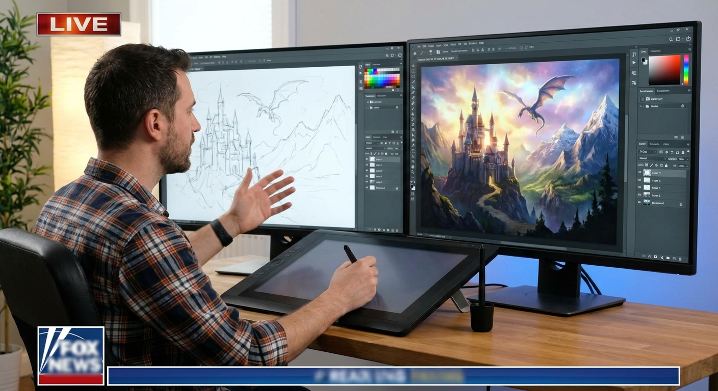
Every great painter—traditional or digital—leans on reference. The magic of digital art is how easily you can collect, organize, and remix photos into something new.
Why Photo Reference Is a Superpower (Not a Crutch)
This guide shows you, step‑by‑step, how to gather references, analyze them, and transform them into original digital paintings. Think of it as a structured “reference lab” you can revisit for any project.
1. Building a Smart Reference Library
First, you need good raw material.
What to Collect
Create folders (or boards) for:
- Anatomy & People – faces, hands, poses, clothing
- Environments – cities, forests, interiors, skies
- Materials & Surfaces – metal, skin, fabric, glass, stone
- Lighting & Color – sunsets, neon signs, fog, firelight
- Mood & Composition – film stills, photography, other art
Use tools like Pinterest, PureRef, Eagle, or just OS folders.
Hands‑On Task
Spend 20–30 minutes and:
- Create a root folder:
REFERENCE_LIBRARY. - Add at least 5–10 images to each category.
- Rename files with useful tags (e.g.,
warm_sunset_city_01.jpg).
You’re building a visual pantry you’ll cook from later.
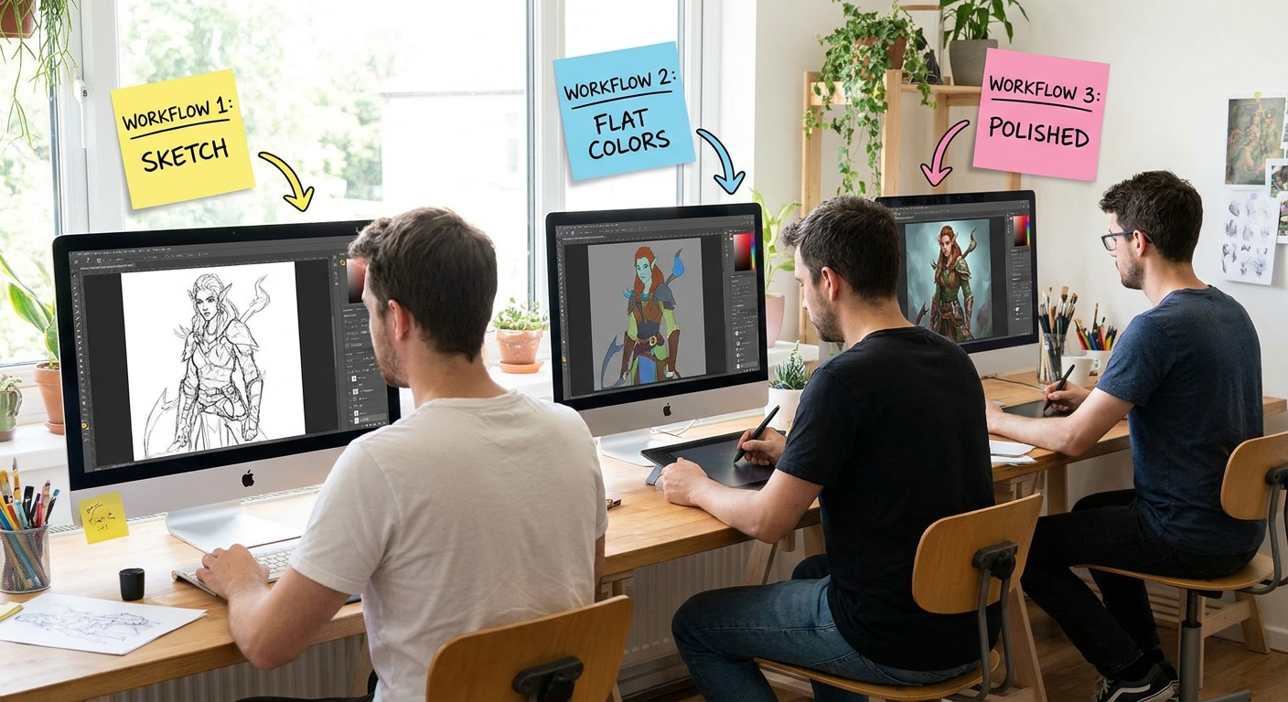
2. Single Photo Study: Copy, Then Interpret
Start with one good photo.
Step 1: Set Up Side‑By‑Side
- Open your painting app.
- Place the photo on one side (or on a separate window/monitor).
- Create a new canvas roughly the same proportions as the photo.
Step 2: Block In Big Shapes
- Use a hard round brush with 100% opacity / 80–100% flow.
- Squint at the photo to blur details.
- Paint only 3–5 big shapes: sky, ground, buildings, main figure.
Ignore details; just match big value and color zones.
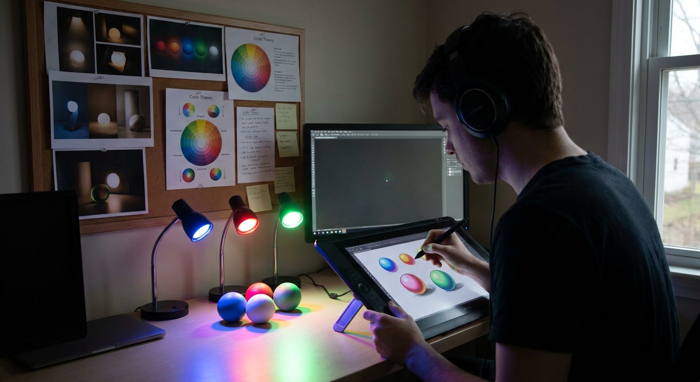
Step 3: Value First (Optional but Powerful)
You can:
- Convert the photo to grayscale.
- Paint your study in grayscale.
Then, add color on top via Overlay/Color layers.
This trains your value judgment without color distraction.
Step 4: Time Limit Yourself
Give yourself 30–40 minutes max. Mark what you learned:
- Did you capture the main light?
- Do the proportions feel right?
- Is the mood similar to the photo?
Label the layer or file PHOTO_STUDY_[subject]_[date].
3. Deconstruction: What Are You Actually Studying?
To make photo studies useful, consciously choose what you’re focusing on.
Use this simple framework and pick one per study:
- Shape & Proportion – drawing accuracy, perspective
- Value & Light – light source, contrast, form shadows
- Color & Temperature – warm vs cool, saturation, palettes
- Texture – how surfaces look and feel
Exercise: Annotate Your Photo
Duplicating your reference image on a new layer, draw over it:
- Arrows for light direction
- Circles highlighting key shapes
- Labels for material types (skin, cloth, metal)
- Note where warm vs cool colors appear
This teaching‑yourself step cements the learning.
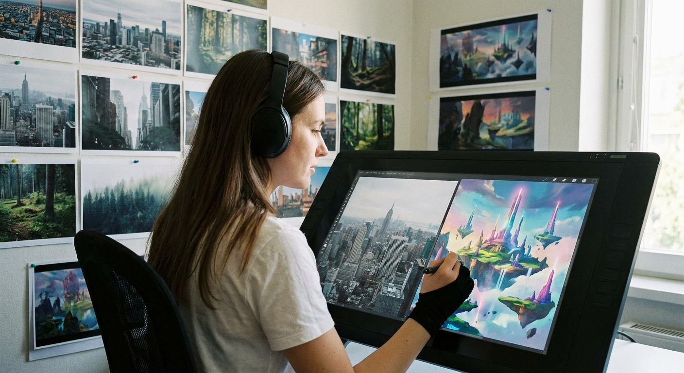
4. Multi‑Reference Moodboard for an Original Piece
Now we go from copying to creating.
Step 1: Choose a Concept
Pick something simple but imaginative:
- “Wanderer in a neon alley after rain”
- “Forest shrine at dawn”
- “Desert pilot resting by a crashed ship”
Step 2: Build a Moodboard
Using PureRef, your painting app, or a collage:
- Drop in 5–10 images:
- 2–3 for environment
- 1–2 for character/clothing
- 1–2 for lighting/mood
- 1–2 for texture/material
Arrange them so the most relevant ones are largest.
Step 3: Extract, Don’t Copy
Ask from each reference:
- What specific thing am I stealing?
- Color palette?
- Lighting angle?
- Pose?
- Texture idea?
Write these right on your moodboard using a text tool.
Now, when you paint, you’re not tracing—you’re borrowing ingredients.
5. Using Reference Without Losing Style
Worried your art will look “too photo”? Use these constraints:
No Color Picking from Photos (for this exercise)
- Eyeball the color instead. This builds your internal palette.
Shape Simplification Rule
- Reduce complex shapes to 3–5 big shapes before adding detail.
Stylize Proportions Intentionally
- Decide: bigger eyes? Exaggerated silhouettes? Sharper angles?
Turn Off Reference Regularly
- Hide or minimize your reference every 5–10 minutes. - Paint from memory, then bring it back and compare.
These constraints force your personal interpretation to emerge.
6. Practical Workflow: Paint‑Over vs Paint‑Beside
Digital tools offer two main ways to use photos.
Option A: Paint‑Beside (Most Educational)
- Reference is off to the side.
- You paint on a blank canvas.
- Best for learning drawing, color, and form.
Option B: Paint‑Over (Efficient for Production)
Use paint‑overs when you need to move fast or design complex scenes.
Example Workflow: Environment Paint‑Over
- Import a photo of a street.
- Lower its opacity to 50–70%.
- Create a new layer above set to Normal.
Start painting over:
- Replace signs with your own designs. - Change lighting (day to night). - Add characters or props.
As you go, gradually cover the original photo with your own paint until it’s mostly your work.
Label such files clearly: PAINTOVER_[purpose] so you remember the process.
7. Brush & Layer Tips for Photo‑Based Work
Suggested Brushes
- Hard Round / Flat – for structure and clean edges
- Soft Round – for gradients and sky
- Texture Brush – to break up photo smoothness
Useful Layer Modes
- Multiply – deepen shadows or darken areas
- Overlay / Soft Light – add color or contrast
- Color – shift hues while keeping values
- Screen / Add (Linear Dodge) – intensify lights and glows
Non‑Destructive Adjustments
Use Adjustment Layers (or their equivalents):
Hue/Saturationto nudge colorColor Balancefor warm/cool shiftsLevels/Curvesfor contrast
Apply them to references and your painting to keep everything harmonized.
8. Three Progressive Projects with Reference
Use these as mini‑assignments.
Project 1: Direct Study + Stylized Variant
- Pick a portrait photo.
- Do a 1‑hour realistic study.
Then, hide the reference and from memory paint a stylized version:
- Exaggerate features - Change colors - Simplify shapes
Compare the two. You’ll see which realism skills transfer into style.
Project 2: Reference Mashup
Choose 3–4 photos:
- One for character - One for environment - One for lighting - One for texture/mood 2. Thumbnail 3 small compositions that combine them. 3. Pick one and paint it to 70–80% finish.
Project 3: Light Swap on a Single Reference
- Pick a strong reference photo.
- Paint it faithfully once.
Then, using the same drawing, repaint it with:
- Opposite light direction - New color palette
This teaches you to own the lighting instead of just copying.
9. Ethics & Practicalities of Reference Use
A few guidelines:
- For practice, you can copy almost anything (don’t present it as original).
- For portfolio or commercial work:
- Avoid recognizable elements from others’ IP.
- Don’t paint‑over other artists’ work without permission.
- Stock or your own photos are safest for heavy paint‑overs.
When in doubt, err on the side of originality: use reference as a guide, not a blueprint.
10. Visual Thinking Checklist Before You Paint
When sitting down with references, ask:
What is my main focus: shape, value, color, or texture?
What single story/mood am I aiming for?
Which 3 photos serve that story best?
How will I change them (composition, lighting, style)?
Answering these in a quick text note layer or notebook aligns your reference use with your creative goal.
Conclusion
Photo reference doesn’t replace your creativity—it fuels it. With an organized library, intentional studies, and smart paint‑over techniques, you can transform bits of reality into original digital worlds.
Pick one photo right now. Open your painting app, set a 30‑minute timer, and do a focused study. Then close the photo and repaint it from memory with a twist. That cycle—observe, analyze, reinterpret—is where real growth happens.