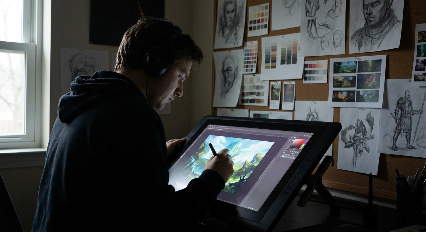
If you paint too slowly, you never finish. If you rush, your illustrations look shallow. The trick is to design a workflow where you move fast at the right moments and slow down only where it counts.
Why Balancing Speed and Detail Matters
This guide compares two practical workflows:
- Speed-First Workflow – great for concept art, client drafts, and social media pieces.
- Detail-First Workflow – great for print-ready work, covers, and portfolio pieces.
We’ll look at when to use each, how to set up your canvas, and exact brush/ layer setups to keep you efficient.
The Core Idea: Three Speeds of Illustration
Think of your process in three speeds:
- Fast (Design) – thumbnails, rough composition, big values.
- Medium (Structure) – drawing, clean shapes, basic lighting.
- Slow (Refinement) – details, polish, micro-adjustments.
Most problems happen when you go slow too soon—zoomed in on eyelashes before you’ve solved the pose.
Workflow A: Speed-First Illustration
Use this when:
- You have a tight deadline.
- You’re still exploring ideas.
- The final use is small (social media, UI icons, game concept).
Step 1: Time-Boxed Thumbnails (Fast)
- Set a timer: 15–20 minutes.
- Use a hard round brush at ~80–100% opacity.
- Draw 10–20 tiny compositions in grayscale.
Rules:
- No erasing, only painting over.
- Only 3 values: dark, mid, light.
At the end, pick 1–2 promising thumbnails.
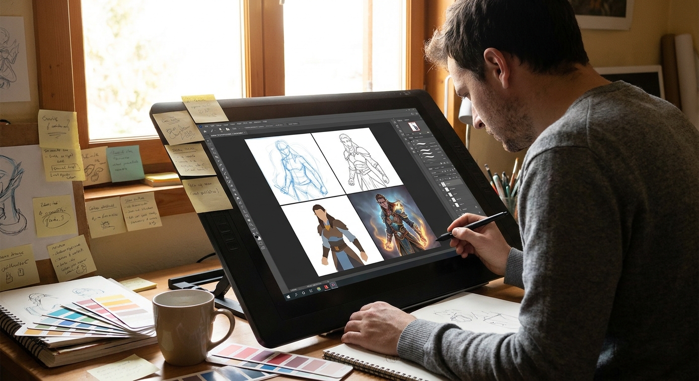
Step 2: Direct Painting on Top (Medium)
- Scale up your chosen thumbnail to 2500–3500px wide.
- Add a new layer, keep the thumbnail underneath as a guide.
- With a textured brush, start painting directly over the thumbnail.
Brush setup:
- Opacity: 70–100%.
- Flow: 60–80%.
- Pressure: size + slight opacity.
You’re skipping line art and going straight to forms. Keep zoom at 25–50%. No micro details yet.
Step 3: Color Glaze (Fast)
- Add a
ColororOverlaylayer above.
Glaze broad color zones:
- Sky/environment - Major character areas - Accent colors
Don’t worry about precise rendering, only color mood.
Step 4: Focal Point Pass (Slow)
Now you’re allowed to slow down—but only for your focal area.
- Create a new layer above everything for the face/hands/hero object.
- Use a smaller brush (detail brush) and higher zoom (50–70%).
- Sharpen edges, refine lighting, add texture only there.
Leave the rest softer. This contrast in detail helps the focal point pop and saves you time.
Step 5: One-Adjust Rule (Fast)
Before exporting, you get one global adjustment layer stack:
LevelsorCurves: tighten contrast.Color BalanceorSelective Color: nudge mood.
Limit yourself to 5–10 minutes here. Then stop.
> Use Case Example: Daily painting challenges, quick fanart, client "first look" concepts.
Workflow B: Detail-First Illustration
Use this when:
- You’re making a key portfolio piece.
- The final output is large (poster, book cover, print).
- You need clear, accurate forms and clean rendering.
Step 1: Structured Drawing (Medium)
Instead of rushing, invest in a solid drawing foundation.
- Canvas: 4000–6000px long side, 300 dpi.
CONSTRUCTION layer:
- Use a pencil brush. - Block in perspective, major forms, gesture.
CLEAN LINE layer:
- Lower opacity of construction. - Use an inking brush at 100% opacity. - Vary line weight to show depth and light.
Spend a full session (1–2 hours if needed). A strong drawing saves you more time later than any brush trick.
Step 2: Precise Flats (Medium)
Use lasso tools + hard round brush.
Layer structure:
BG_FLATSCHAR_FLATSPROP_FLATS
Method:
- Select areas with the lasso.
- Fill with local color.
- Lock transparency for each flat layer.
This gives you clean, editable shapes—critical for revisions.
Step 3: Separate Light and Shadow Logic (Medium→Slow)
Instead of winging it, define clear rules.
- Add a text layer with:
LIGHT: warm from top right; SHADOW: cool bounce from ground.
Lighting process:
SHADOWlayer (Multiply). Use a neutral color (cool gray or purple).LIGHTlayer (Soft Light/Overlay). Use warm/yellow hues.
Paint systematically:
- First pass: big shadow masses.
- Second pass: core shadows and reflected light.
- Third pass: direct highlights on a normal layer.
This might take longer, but the result looks cohesive and believable.
Step 4: Material Pass (Slow)
Zoom to ~60–80%, switch to your textured and detail brushes.
For each major material:
- Skin: soft transitions, subtle hue shifts (reds in mids, yellows in lights, cooler in shadows).
- Metal: strong contrast, hard highlights, crisp edges.
- Cloth: more diffused light, softer edges, folds suggested rather than hyper-rendered.
Work material by material, not area by area. This keeps your rendering consistent.
Step 5: Final Integration and FX (Medium)
Bring things together with a few careful tricks:
Ambient Occlusionlayer (Multiply, low opacity) around creases, where objects touch.Rim Lightlayer to separate character from background.- Subtle
NoiseorTexturelayer on top at 5–15% opacity to unify.
Spend time here, but keep referencing your zoomed-out view every few minutes.
> Use Case Example: Portfolio splash illustrations, marketing art, cover commissions.
Choosing the Right Workflow for the Job
Ask these questions before you start:
Deadline: How many hours do I truly have?
Output Size: Will this be printed or mostly viewed on phones?
Revision Risk: Is the client likely to change their mind?
Purpose: Practice piece, experiment, or flagship portfolio work?
Quick Guidelines
- If time is short or ideas are fuzzy → Speed-First Workflow.
- If you’re locked into a concept and need high fidelity → Detail-First Workflow.
- For many jobs: start with Speed-First for exploration, switch to Detail-First once the idea is approved.
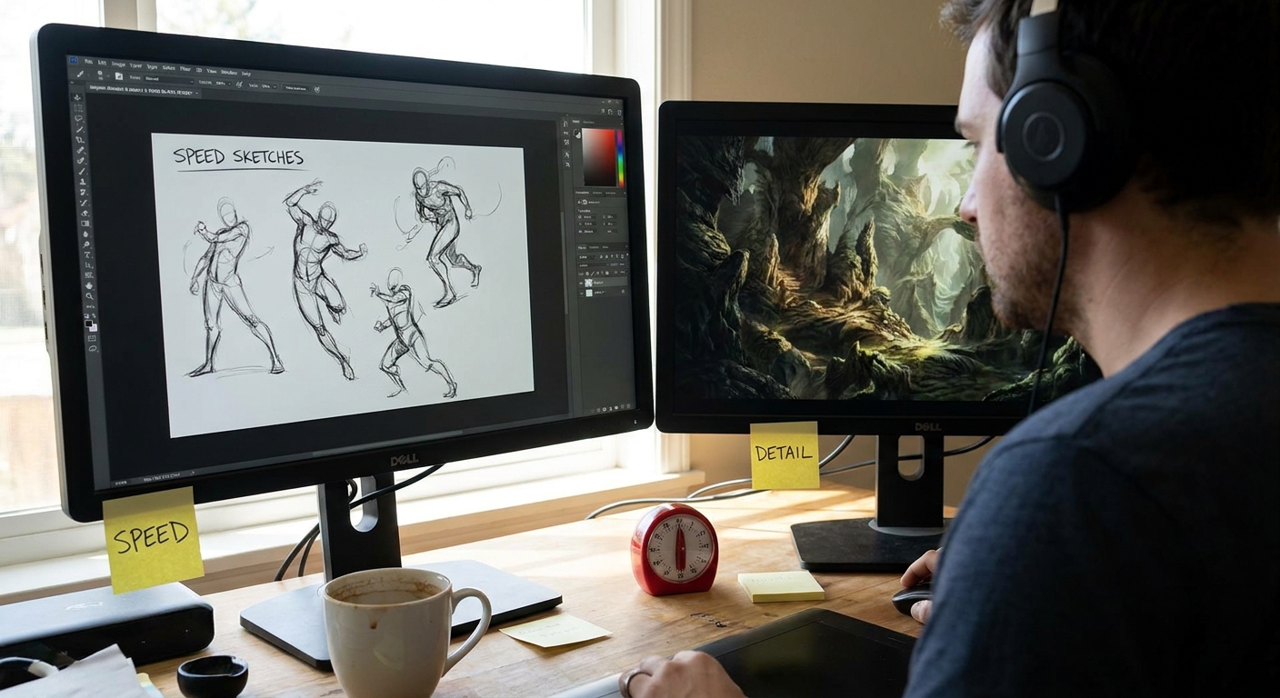
Tool & Brush Tips for Working Faster and Cleaner
1. Custom Shortcuts
- Assign hotkeys to: Brush, Eraser, Lasso, Color Picker, Flip Canvas, and Zoom.
- This reduces friction between thinking and doing.
2. View Modes
- Work at 25–50% zoom for big decisions.
- Check at 100% only for detail passes.
- Create a
CHECKgroup with: - Black & White adjustment layer.
- Levels/Curves.
Toggle to quickly assess values and contrast.
3. Brush Packs vs. Limited Sets
Resist switching brushes constantly. For each project, define:
- 1 hard brush
- 1 textured brush
- 1 soft brush
- 1 small detail brush
Fewer decisions about tools = more decisions about the art.
Practice Drills: Training Both Speeds
Drill 1: 30-Minute Illustration Sprints
- Set a timer for 30 minutes.
- From scratch, produce a tiny finished illustration: rough, but complete.
- Use the Speed-First workflow.
Goal: Train yourself to find big solutions quickly.
Drill 2: Single-Day Detail Piece
- Pick one of your successful sprint thumbnails.
- Dedicate an entire day (or two sessions) to turn it into a Detail-First piece.
Goal: Learn how to scale up an idea without losing the original energy.
Drill 3: Time-Limited Detail Pass
- Take a current WIP.
- Give yourself exactly 60 minutes of focused detail rendering on the focal point.
- Stop when the timer ends.
Goal: Learn to prioritize what to polish.
Final Thoughts: Efficiency as a Creative Tool
Speed isn’t the enemy of quality—randomness is. When you consciously choose between a speed-first or detail-first workflow and understand which stage deserves your time, you gain control over both.
Experiment with both workflows on similar subjects: a character, an environment, a prop. Compare the results. Adjust where you slow down and where you sprint. Over time, you’ll build a custom hybrid process that matches how you think and create, making your illustrations both faster to produce and richer in detail.