Branding doesn’t have to be a corporate logo on a boring slide. For digital artists, your brand is simply:
Your Brand Is Just a Story People Remember
> The visual story people remember when they think of your work.
In this workshop-style article, we’ll draw your brand instead of writing a stiff business plan. You’ll end up with:
- A visual brand storyboard
- A color + brush style guide
- Practical settings in Procreate/Photoshop/Clip Studio
- A posting framework that actually feels like making art
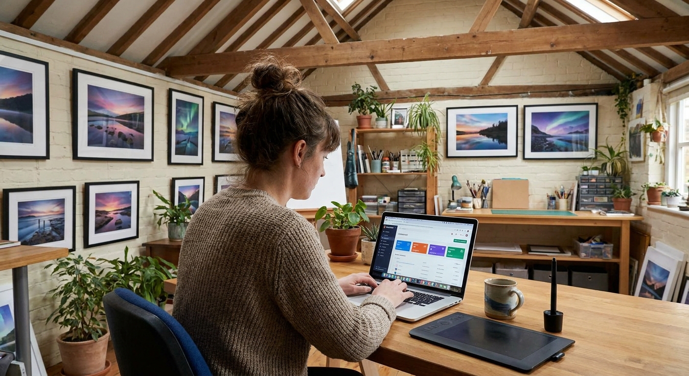
Grab your tablet and think of this as designing a character—except the character is your art identity.
Step 1: Draw Your Brand as a Character
Open a new canvas:
- 2000×2000 px, 300 DPI, sRGB
- Use any sketch brush at 30–60% opacity
Exercise: Brand Character Sheet
In four panels (2×2 grid), sketch:
Mood: Is your brand cozy, chaotic, elegant, spooky, cute?
Environment: Cafes? Space? Forests? Neon cities?
3. Objects: 5 objects that fit your art vibe (candles, game controllers, swords, plants, etc.). 4. Audience: A quick doodle of the people you imagine enjoying your art.
Label each panel with 1–3 words.
This becomes the emotional base of your brand.
Step 2: Build a Simple Style Triangle
Next, we’ll define your style visually.
On a fresh canvas, draw a triangle. Label the corners:
- Realism
- Stylization
- Abstraction
Now:
- Place a dot where your art currently sits.
- Place another dot where you want it to sit as a brand.
Repeat for a second triangle:
- Soft / Pastel
- Bold / High Contrast
- Muted / Earthy
These two triangles are your style compass. Keep them open while designing products, banners, and thumbnails.
Step 3: Lock In a Color Language
Palette Creation Workflow
In Procreate:
- Open one of your favorite finished pieces.
- Tap
Color → Palettes → + → New from artwork. - Delete any colors you never want to use again.
- Keep 8–12 core colors.
Window → Swatches.- Use the Eyedropper tool (I) on key colors.
- Click
New Swatchto save them.
In Photoshop:
Color Rules for Brand Consistency
Define these in a written note layer or a separate file:
- Base colors (for skin, backgrounds, UI panels)
- Accent colors (for highlights, buttons, callouts)
- No-go colors (e.g., "No pure neon green unless it’s a horror piece")
Mini Exercise:
Create a small 3-panel comic using only your brand palette. See how it feels; tweak accordingly.
Step 4: Choose "Brand Brushes" and Save Their Settings
Instead of using every brush you own, pick a core set that defines your brand’s texture.
Procreate Brush Kit Setup
Pick:
- 1 sketch brush
- 1 line art brush
- 1 flat fill brush
- 2 texture/painting brushes
Recommended starting settings:
Sketch Brush
- Stabilization: 0–10
- Opacity: 80–100%
- Size: 3–10% on a 3000 px canvas
- Stabilization: 20–40 for clean curves
- Streamline (legacy): 25–35%
- Pressure curve: adjust so light pressure still gives visible lines
- Grain scale: 20–50%
- Opacity jitter: 0–15%
- Flow: 50–80%
Line Art Brush
Texture Brush
Create a brush folder named Brand_Core and drag your chosen brushes there.
Photoshop / Clip Studio:
- Create a new brush group
Brand Core - Right-click favorite brushes →
Duplicate→ store in that group
Use this set for all public-facing work: banners, posts, shop thumbnails, and tutorials.
Step 5: Design a Recognizable Signature & Logo the Fun Way
You don’t need a complex logo—your signature + a simple mark is enough.
Signature Design Exercise
Canvas: 1500×500 px, 300 DPI.
- Try writing your artist name or alias 20 times.
- Use your line art brush from the
Brand_Coreset. - Circle 2–3 that are legible and on-brand.
- Simplify further: maybe add a symbol (star, leaf, pixel heart) next to it.
Export as PNG with transparent background. This is your watermark.
Use it on:
- Prints
- Social posts
- Banners
Keep it consistent in placement (bottom right or left) and scale (2–5% of the image width).
Step 6: Create Your Brand Storyboard (Portfolio in Disguise)
We’ll now build a one-page storyboard that explains your brand visually.
Canvas: 3000×4000 px, 300 DPI, vertical.
Divide it into 6 panels (2 columns × 3 rows).
Fill panels with:
- Hero Piece – your favorite finished illustration.
- Process Strip – 3 small images: sketch → line → color.
- Color Swatches – your palette with labels.
- Brand Character – from Step 1.
- Audience Snapshot – a doodle of your ideal viewer.
- Logo / Signature + Tagline – e.g., "Cozy fantasy worlds in pixels."
This storyboard becomes:
- Your about page image
- A pinned tweet / post
- A reference for future products
Step 7: Align Your Social Banners & Avatars
Avatar Tips
- Use a close-up: your OC, self-portrait, or brand symbol.
- Strong, simple shapes.
- High contrast around the face or focal point.
- 800×800 px, 300 DPI
Canvas:
Banner Tips
- Treat it like a wide illustration of your world.
- Show 2–3 of your recurring themes or characters.
- Include your signature and a subtle tagline.
- Twitter (X) banner: 1500×500 px
- YouTube banner: 2560×1440 px (keep key info in center 1546×423 area)
Canvas sizes:
Export as JPG, quality 80–90.
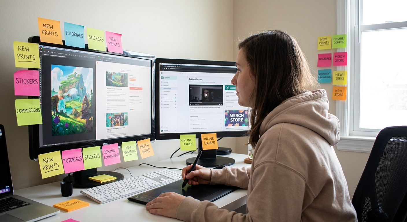
Step 8: The 3-Category Content Framework
To keep your brand alive online, rotate between three types of posts:
Showcase – finished illustrations, shop updates
Process – WIPs, timelapses, brush setups
Personality – small bits of your life or opinions that match your brand vibe
Weekly Posting Plan (Adjust to Your Pace)
- 2× Showcase posts
- 2× Process posts
- 1× Personality post
Prep process content as you work: screen record, take canvas snapshots, and export layer steps.
Software Tips:
- Procreate:
Actions → Video → Time-lapse recordingON - Clip Studio:
File → Timelapse → Record TimelapseON - Photoshop: Use OBS to record while you paint.
Step 9: Check for Brand Consistency (Visual Critique Session)
Once a month, do a quick self-critique.
On a new canvas, paste:
- 9 recent posts or artworks (like an Instagram grid).
- Do they share a consistent palette or value structure?
- Do they look like they come from the same "world"?
- Does your signature/mark appear in the same place and style?
Ask yourself:
Circle any piece that feels "off-brand". Write 1–2 reasons right beside it.
Then decide consciously:
- Do I adjust my brand to include this direction?
- Or keep it as a private / experimental piece?
Step 10: Use Your Brand to Guide Business Decisions
Your visual brand is not just decoration—it’s a filter.
When choosing:
- Commissions
- Collabs
- Product ideas
Ask: Does this fit my storyboard world?
If you’re a "cozy fantasy cottage" brand, maybe skip a hyper-gore comic collab. If you’re a "cyberpunk UI" brand, a pastel baby room mural might not fit.
This clarity:
- Saves time
- Attracts better-fit clients
- Makes your portfolio and shop feel intentional
Wrap-Up: Branding as an Ongoing Sketch
Your brand doesn’t have to be fixed from day one. Let it evolve like a sketchbook:
- Start with your brand character and storyboard.
- Lock in a simple brush + color kit.
- Tweak as you notice what feels natural and what resonates with your audience.
The goal isn’t perfection—it’s recognizability. When someone can spot your work in a feed without seeing your username, your visual branding is doing its job.